Webflow is a fantastic platform with many features that any skilled person on website building can use to make their next site or eCommerce business.
eCommerce is a big business. Online shopping is vital to many companies and if you don’t have your own eCommerce shop, you are for sure missing out and not taking advantage of the online world.
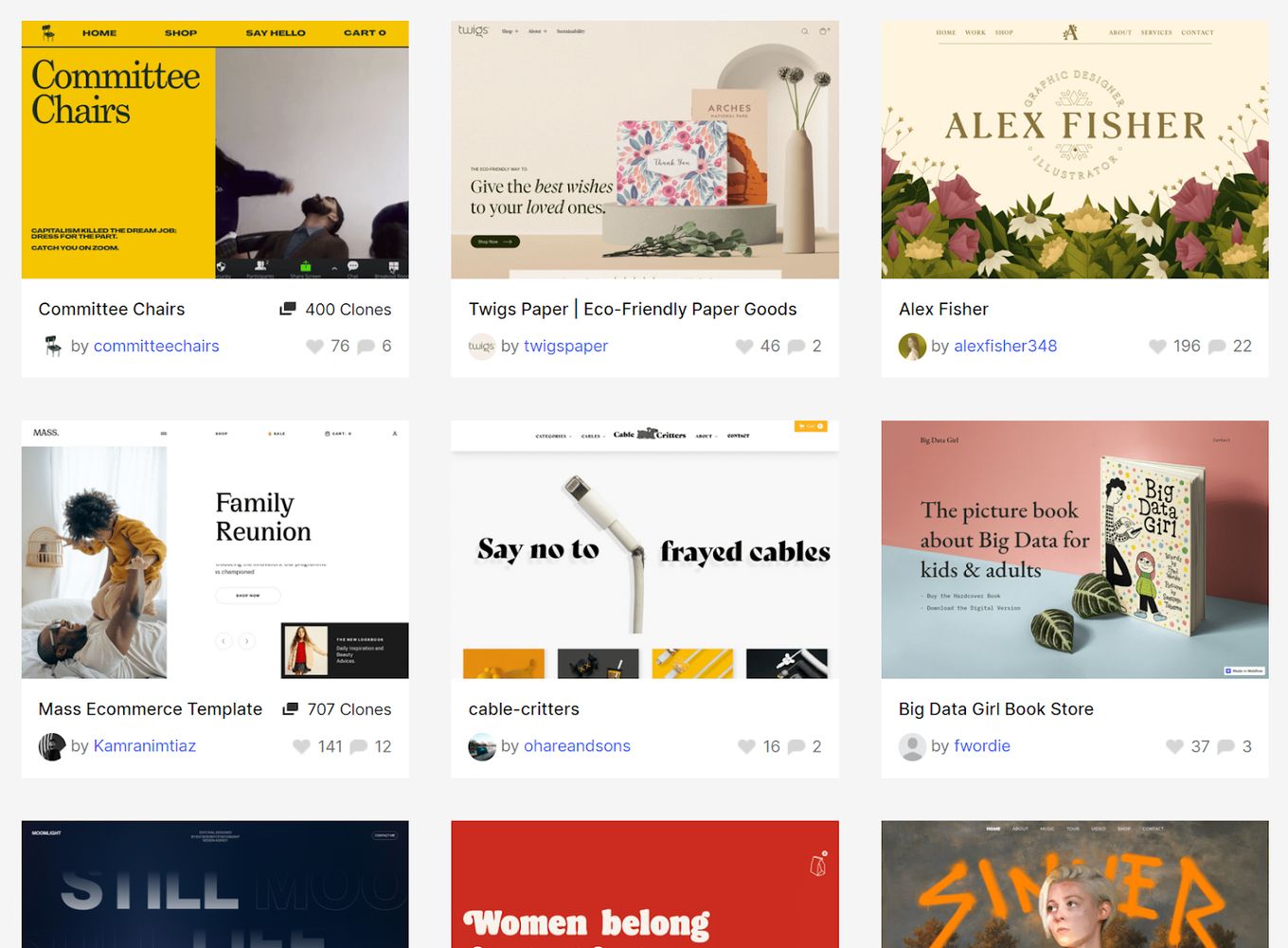
With Webflow eCommerce templates, you can start from scratch or clone a project and create your site from a pre-built design, but you can still make something unique either way.
In this article, we will be exploring both Webflow templates and “cloneables” that you can use yourself. Most of the templates are free to use, but we can discover Webflow eCommerce pricing later on.
10 Webflow eCommerce Templates & Cloneables
Let’s dive straight in and look at some amazing Webflow templates, there will be something here that you can use to build your next eCommerce project with Webflow. We will go through some specific design templates and some fully functioning eCommerce sites that you can clone for different use cases.
1. Alex Fisher Design: Portfolio and Print Shop
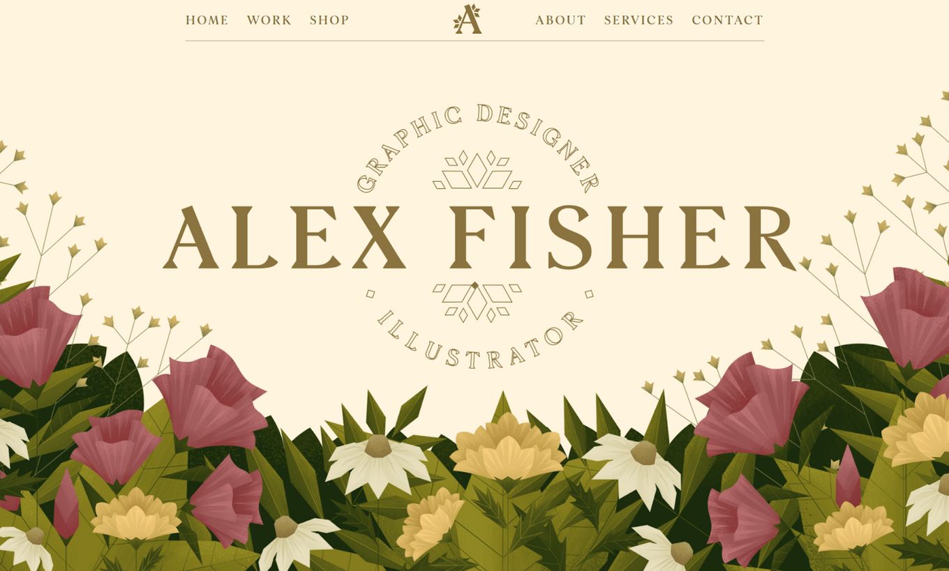
A stunning example of what you can do with Webflow and how you can create an amazing portfolio website – with the added feature of a print eCommerce shop.
Some Webflow eCommerce templates will only come with the first page and miss out on the product pages. But this one is a fully complete website with the shop pages as well, so you have a full template to work from.
It has subtle animations, smooth scrolling, and a portfolio slider to show off the work and items for sale.
2. Halal Lab eCommerce Template
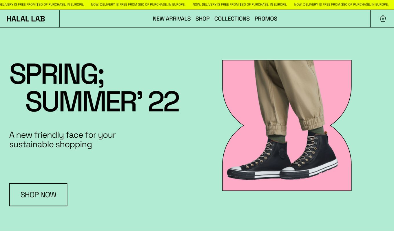
A wonderful example of what Webflow eCommerce templates can look like. Very eye-catching and in your face with the bold colors and harsh lines between elements.
The home page is great for showing off the different categories and makes great use of white space between large-scale product images, engaging users on the site.
It uses subtle fade-in animations across the template and uses sliding text for important information.
3. JetBoost Focus Camera Store
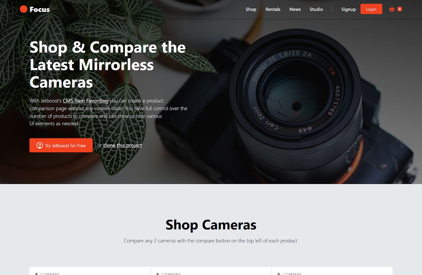
A focused template on product comparisons, the example being professional photography cameras. But this template could be converted to be comparing anything.
This is part of some of the unique Webflow eCommerce templates around, the custom comparison product table is extremely helpful with certain products and you can clone this to take advantage yourself.
The product page uses a grid layout, and comes with a product slideshow of multiple product images and zoom options.
4. Memberstack eCommerce Dashboard
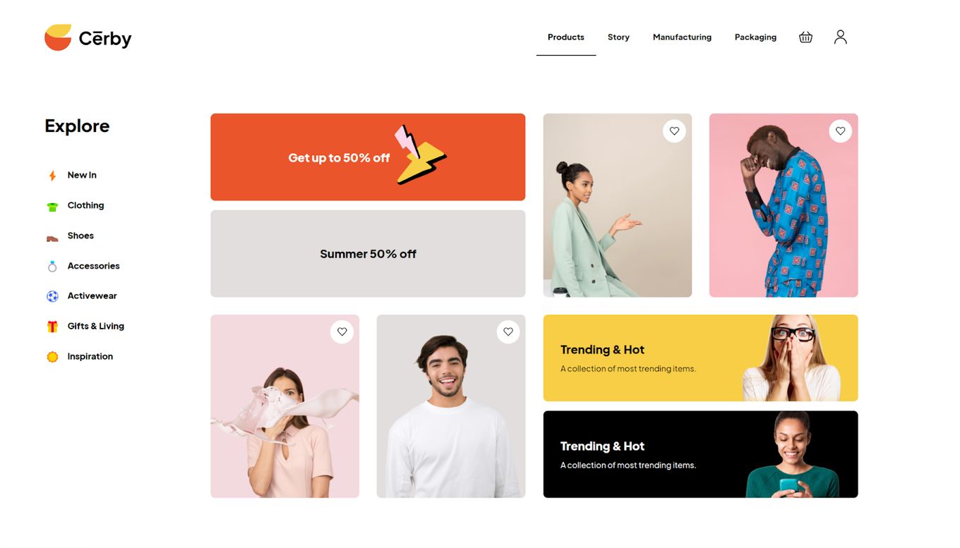
A starting template that you can use for an eCommerce dashboard. You can use it to create a staff or front-end user dashboard to either manage their account or navigate your website.
It will be easy enough to get this dashboard layout into Webflow and make new pages for each navigational link on the side, it is a great starting point. It uses a grid-based layout and makes use of emojis as link icons.
You have everything you need to get started and create something unique, use the Webflow editor, and build something amazing.
5. Juo Ecommerce For Webflow

A trendy and fresh interior design template that you can clone, uses fancy animations up-on loading and subtle animations throughout.
The products are displayed using a full-screen slider, so as you scroll, the products slide across the screen. Clicking them shows their product details displayed as a modal screen.
The design is very energetic, the colours of very bold, it feels very authenticate and the large scale images help engage a visitor with the design.
6. Dusty E-Shop

If you are looking for basic Webflow eCommerce templates, then this template is for you. You can use this to get started and create something unique – it is great when you don’t want to start from scratch but want something.
The layout is very focused on large images making up most of the structure, so it will work great for showing off products with high resolution images.
It uses a split-screen to display different products when you scroll down, so this could be changed to display men’s vs women’s clothes if this design was used for a clothing store online.
7. Luca Pets eCommerce Site
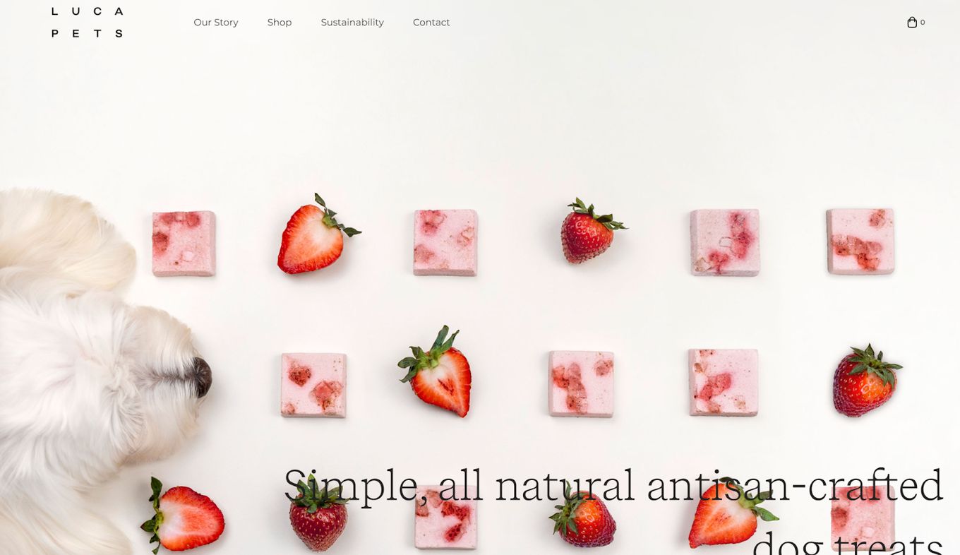
A fully functioning eCommerce site based around healthy dog treats. You can clone this design and run pretty much any product with it but it is definitely focused on food.
Uses subtle on-scroll animations, the design overall is very elegant and uses subtle colors on CTA buttons and marquee text for important information – but it isn’t too distracting.
It even has a complete product page and a working “Add to cart” button. Each product page has a nice accordion menu that shows item information when clicked, like ingredients and nutrition.
8. Retrip – Speaker Product Template
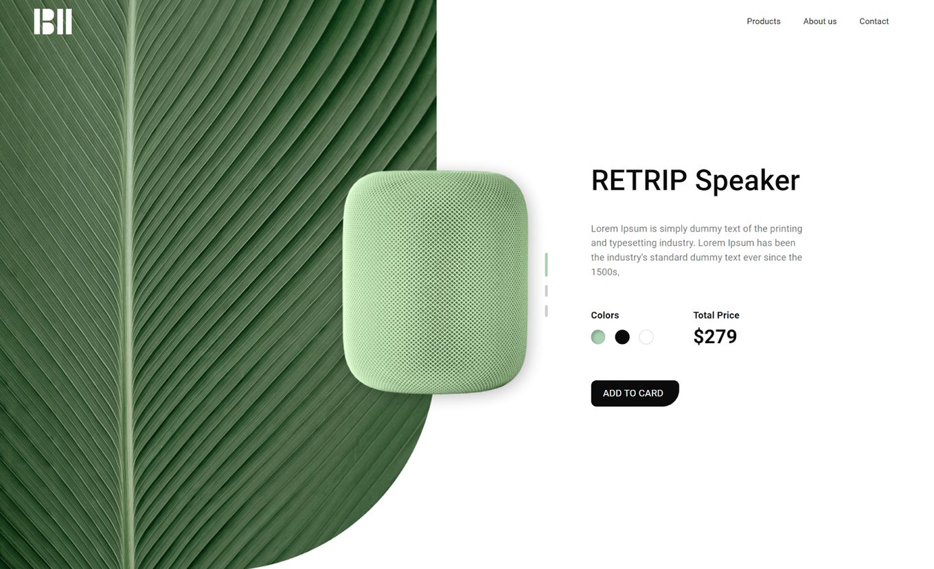
A fantastic product page template based on a speaker, you can select multiple colors and product options.
As you change the color options, the speaker fades and changes to its alternative color, and the background changes with it.
A clean and modern design with great opportunity, large background images, and a minimalist feel to it.
9. Eflow Retail Shop
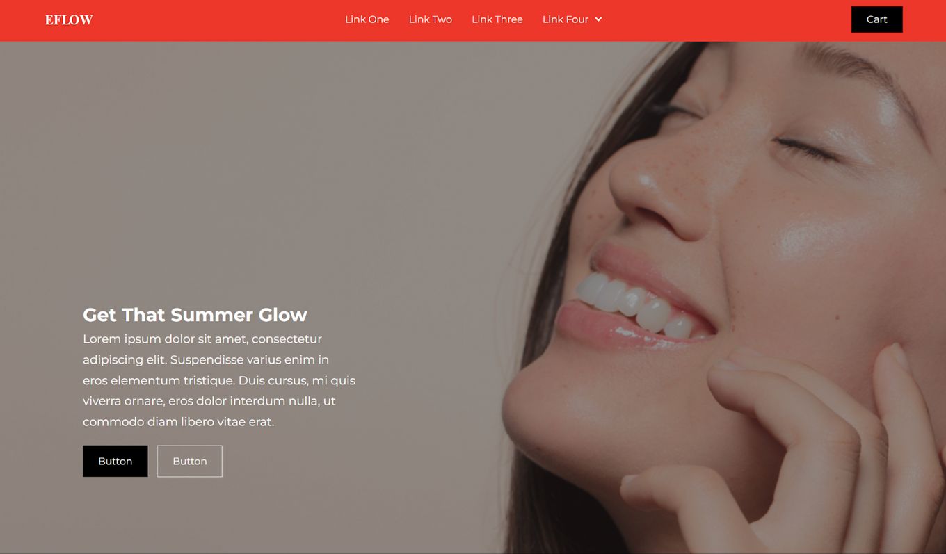
A fully functioning eCommerce website template, with product pages, header navigation links, and a drop-down menu for extra links.
The design overall has a very minimalist feel to it, the main color is red, but this can be easily changed to fit your own brand and style.
It follows best practices when it comes CTA buttons, fonts and layout – a perfect template in the Webflow eCommerce templates category.
10. Modular
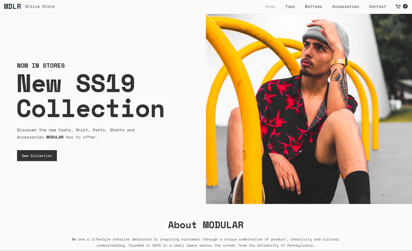
A wonderful example of another clothing shop, a fully functioning template that you can clone and make your own.
It has a clean and minimalist look to it, lots of white space, padding, and large images to make up the general layout. The navigation bar is minimal, no icons and products are displayed in a grid format.
The great thing about this template is that it has a product page and working cart system that you can use. And it even has category pages as well, so products can be displayed via their tags.
Is Webflow Good For eCommerce?
Yes, Webflow is a great choice for business owners and online shops because anyone can use it – you don’t need any coding experience, and you can create something unique. Webflow also has a dedicated set of features just for eCommerce websites, so you can easily start your own online shop without much hassle at all.
How Much Does Webflow eCommerce Actually Cost?
It’s completely free to start building, designing, and publishing a website to Webflow. You just have to deal with the free plan restrictions.
Webflow eCommerce also offers premium plans. The pricing depends on the type of plan: the starting plan costs around $12 and goes up to around $36 a month depending on which features and performance you need. Webflow also can provide custom enterprise pricing if needed.
Is Webflow Good For SEO?
Webflow is one of the best website builders out there in terms of SEO. Unlike other website builders, Webflow makes it really easy to take care of SEO directcly throught the Visual Designer.
You’ll be able to change metadata information, images “alt” text, take care of the sitemap of your site and many more things.
Webflow and its editor produce clean and redable code, which is also imortant for search engines like Google to crawl and rank your site.
This means that whatever you build, you can be sure your website is structured properly and can be indexed by search engines without any trouble. Also, Webflow offers numerous options for SEO meta tags and fields.
You can also easily integrate with Google Analytics and Webflow will also automatically generate a sitemap for you which can be used with the Google Search Console.
![16 Top Webflow Slider Clonables & Examples [Ranked] webflow sliders share](https://alvarotrigo.com/blog/wp-content/uploads/2023/08/webflow-sliders-share-300x150.png)



![9+ Great Website Ideas for 2024 [Show Off Your Skills] website ideas share](https://alvarotrigo.com/blog/wp-content/uploads/2023/08/website-ideas-share-300x150.png)
![15 Best Portfolio Website Builders in 2024 [Reviewed & Ranked] portfolio website builders share](https://alvarotrigo.com/blog/wp-content/uploads/2023/08/portfolio-website-builders-share-300x150.png)