Having an attractive restaurant website design with a beautiful presentation and mouth-watering visuals is instrumental to getting even more customers to patronize your business.
However, understandably, designing a perfect restaurant website may be challenging, primarily because of the complexity of being visually appealing without distracting your visitors.
But there is no need for much worry: we have examined several websites for restaurants and carefully chosen the 15 best restaurant websites to draw design inspiration when looking to build a site for your food business.
Let’s get right into it!
Top 15 Restaurant Website Design Examples for Inspiration
1. Bianca Restaurant
The Bianca Restaurant ranks first in our list of the best restaurant websites. It uses a minimal web design with abundant use of a whitespace background alongside colorful and stylish typography.
This restaurant website features a unique full-screen design that supports the creative display of text and illustrations for easy content digestion. This effect provides your restaurant website with a modern feeling, allowing you to showcase your beautiful food images and videos.
Did you enjoy the full-screen experience employed on this website? You can also replicate the same effect using the FullPage.js JavaScript library that allows you to create brilliant scrollable full-screen restaurant websites. It is also compatible with WordPress for Gutenberg, Divi, and Elementor editors. Check it out!
2. El Catrin
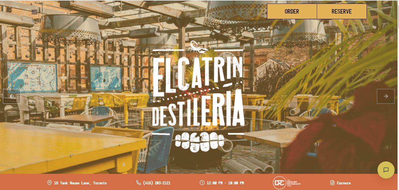
El Catrin uses a playful theme alongside subtle on-scroll animation effects and a beautiful color scheme to grab the attention of their visitors immediately after landing on their homepage.
Apart from these, this restaurant website design also features hero sliders, stylistic typography, and easy-to-locate CTAs – all of these ensure their visitors have a great experience on their site.
3. Adachi
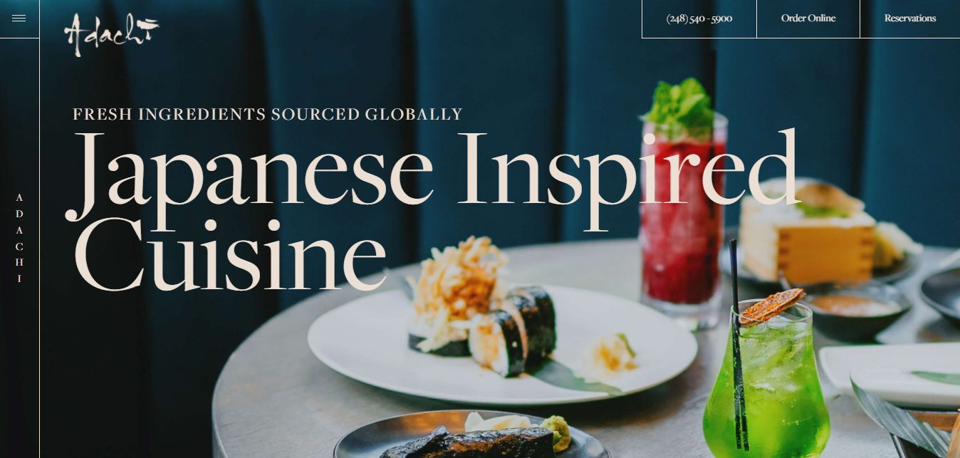
This restaurant website design features elegant typography, breath-taking animations, and stunning food photography that ensures visitors have a great time throughout their stay on the site.
Providing an excellent overall user experience, Adachi also makes ordering, reservations, and purchasing effortless on the website, thanks to the conspicuous CTA buttons included in the design.
4. PHO
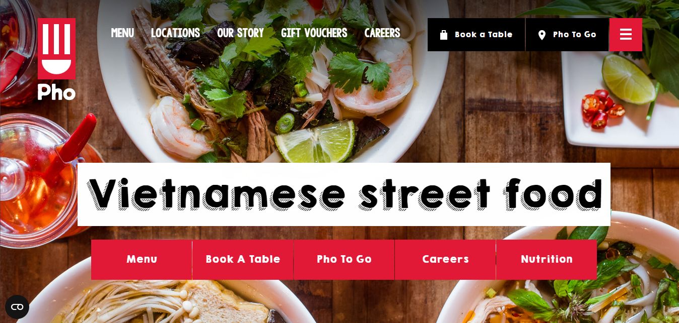
PHO proves that even if you aren’t an expert web designer, you can still create an amazing website for restaurants businesses using WordPress.
This website features high-quality food images as the site background, alongside customized icons and CTA buttons. Navigation is super easy, thanks to the helpful sticky menu included in the website design. It also has a Parallax Effect that creates a unique experience.
Read this article to learn how to replicate the parallax scrolling effect using CSS only on your website.
5. Rosewater
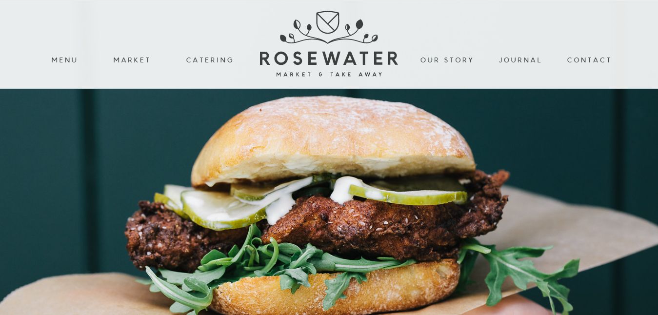
The brilliant blend of whitespace, textual content, and amazing food-themed photographs creates a laudable amusing effect on visitors, causing them to navigate the website even further.
Rosewater restaurant website design features a sticky menu that ensures easy navigation throughout your website, alongside bold typography, eliminating possible distractions by other UI elements on the site.
Like Maialion, the Rosewater Restaurant website also employs the parallax scrolling effect to amuse visitors and ultimately enhance user engagement.
6. Col’Cacchio Pizzeria
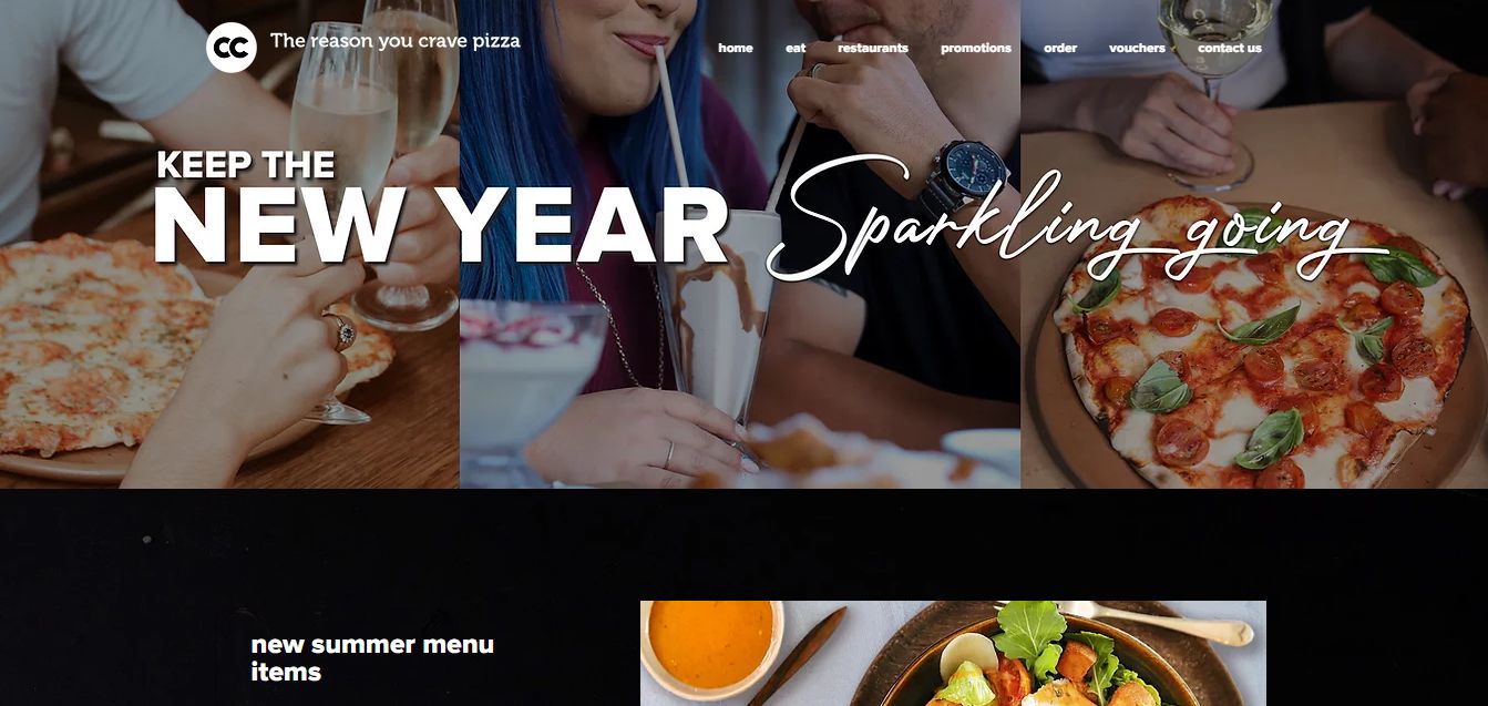
We’ve included Col’Cacchio Pizzeria on this list of 15 best restaurant websites because of their clever use of food pictures throughout the website – this approach makes their offers irresistible to visitors.
The CTA buttons added at significant positions of the page also make their approach perfect! It also features an accessible and appealing menu, ensuring easy navigation.
7. Quay
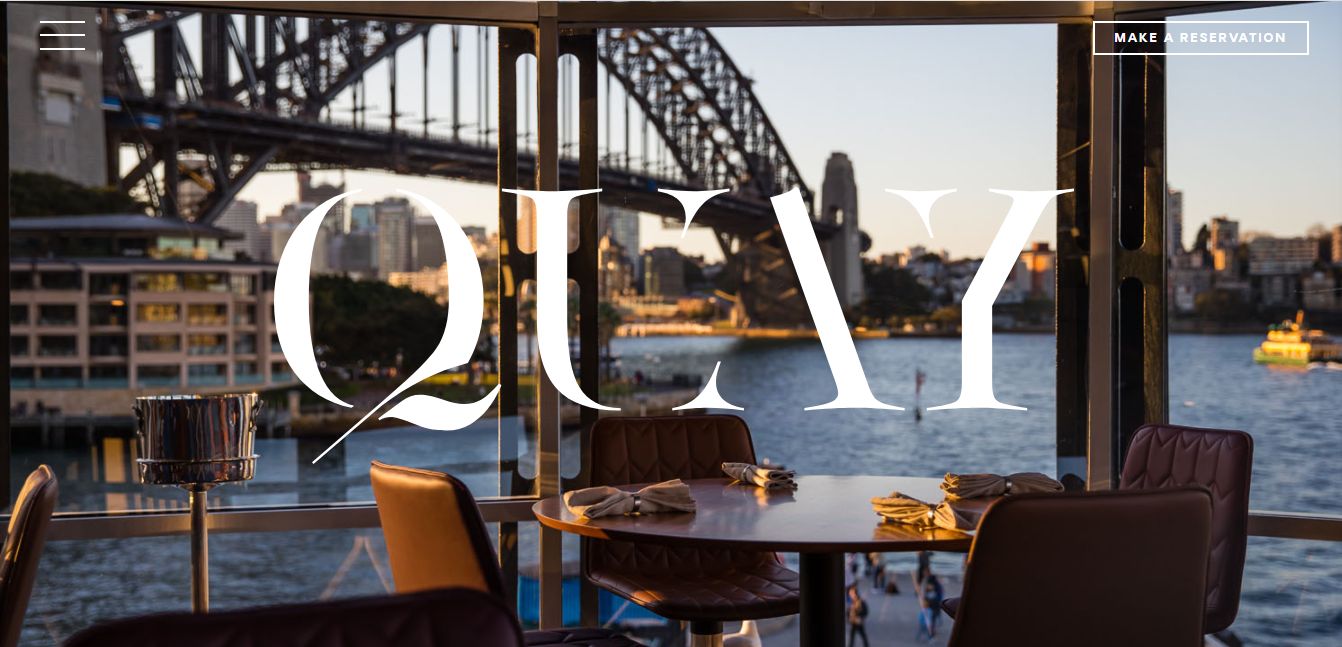
Quay features a relatively sophisticated yet non-distracting website layout. Thanks to the hamburger menu included in its design, the site is also straightforward to navigate. Accessible call-to-action/reservation buttons, bold typography, and the use of high-quality, attractive images are other important characteristics of the Quay restaurant website design.
8. Green Rebel
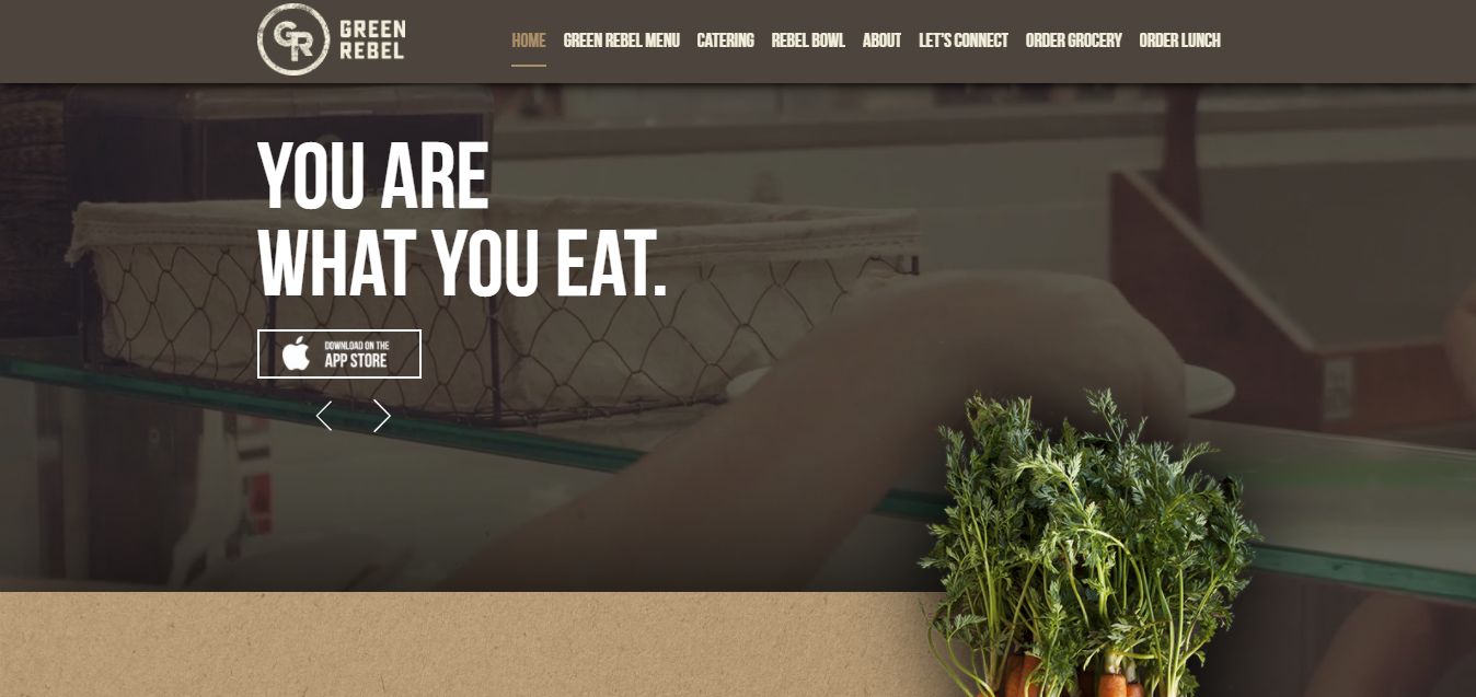
Green Rebel lets its visitors know what they do immediately. As a veggie’s restaurant, their website employs a veggie-themed color blend alongside textured backgrounds and animated photos that clearly show their ingredients and style. Their use of high-resolution videos and illustrations also makes their website engaging and interesting to navigate.
9. Maialino
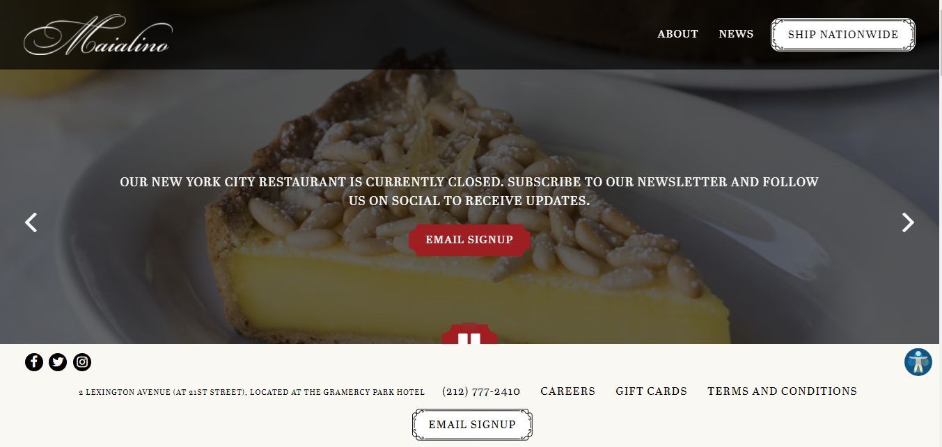
Maialion restaurant website design offers a welcoming feeling, thanks to its mobile-friendliness, fast load time, great use of background images, and stylish typography. The hero slider in its design helps greatly with lead generation, especially with the conspicuous CTA buttons for each slide.
The parallax scrolling effects and sticky footer section are other amusing UI elements employed on this site.
10. O-Ya
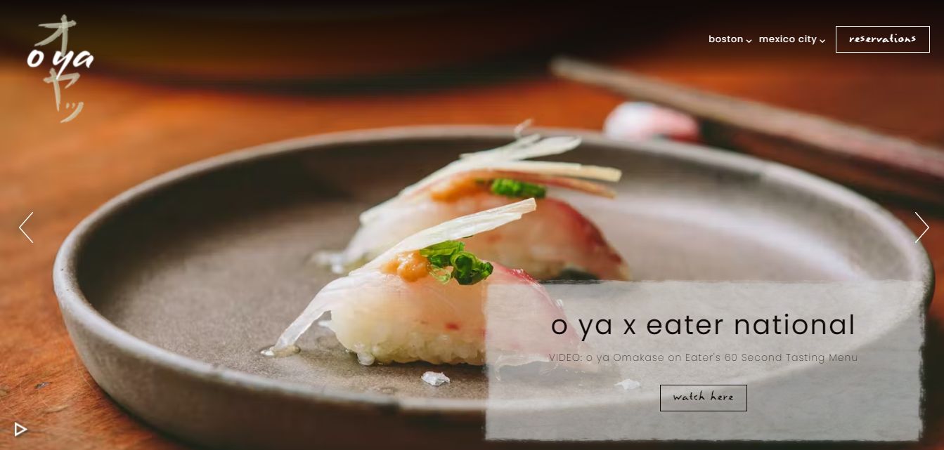
The 10th on our list of best restaurant websites is the O Ya restaurant. O Ya features a minimalistic design with clear navigation, making it easier for their visitors to make reservations. The use of an amazing hero slider design to showcase some of their products is one of the best features of this website.
11. Kado No Mise
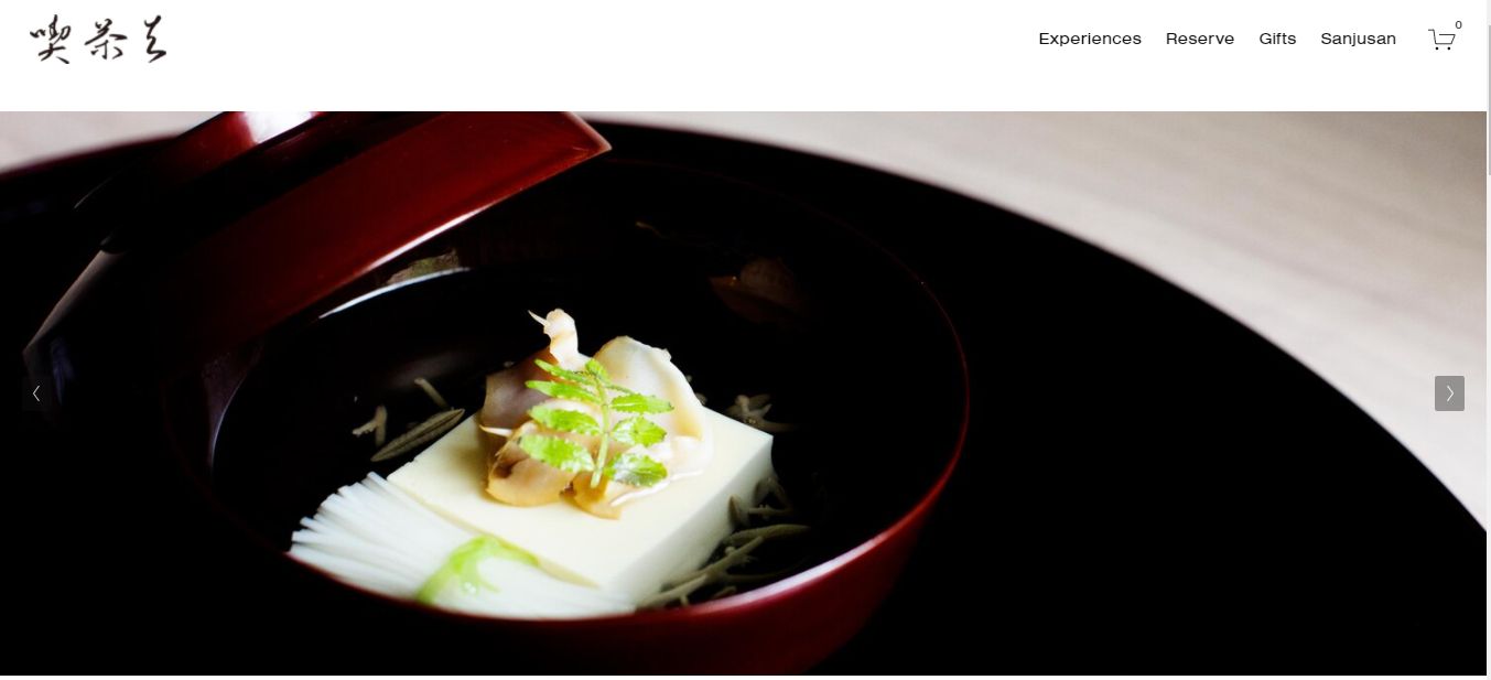
Simple design and brilliant use of whitespace are the major aesthetic features of the Kad No Mise restaurant website. The two UI approach significantly helps avoid distractions, ensuring their visitors are only focused on what matters the most – their content and CTAs.
The navigation bar attached to the top of the website also ensures easy navigation, helping their visitors and prospects find what they seek very quickly. Kado No Mise also integrates eCommerce features, granting them total control over their profits.
12. Whitman’s
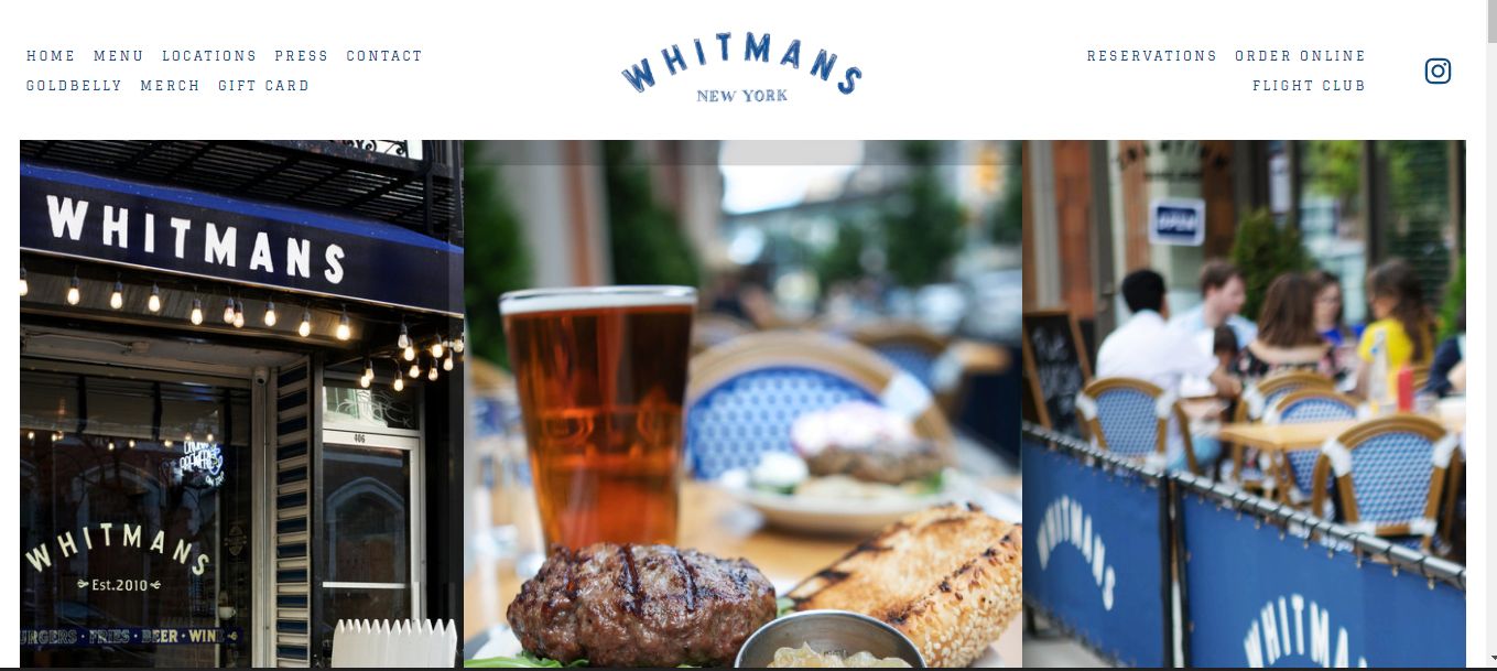
Whitman’s capitalizes on social proof: this restaurant website design features sections of their Instagram page, both at the top and bottom of the homepage. Also, the use of mouth-watering photos and an enabling website layout makes the site appear more engaging. Whitman’s is also easy to navigate, thanks to the menu included at the header and footer section.
13. Maison Lameloise
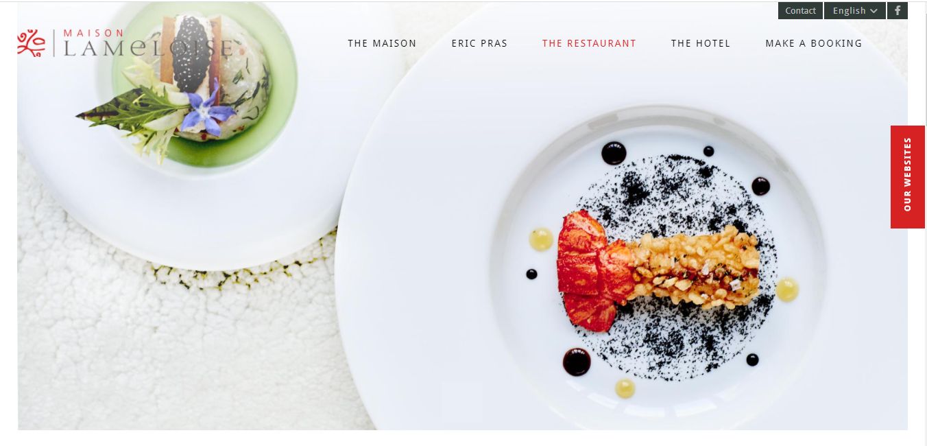
Another example worthy of mention on our list of the best restaurant websites is Maison Lameloise. This website creatively balances whitespace, colorful imagery, media content, and stylistic typography to create a unique feeling for its visitors.
The amazing hero image slider included at the top of the homepage helps welcome prospects to the site, encouraging them to navigate even further. Interestingly, navigation is also straightforward, and visitors can find what they seek quicker than ever imagined.
14. Protein Bar & Kitchen
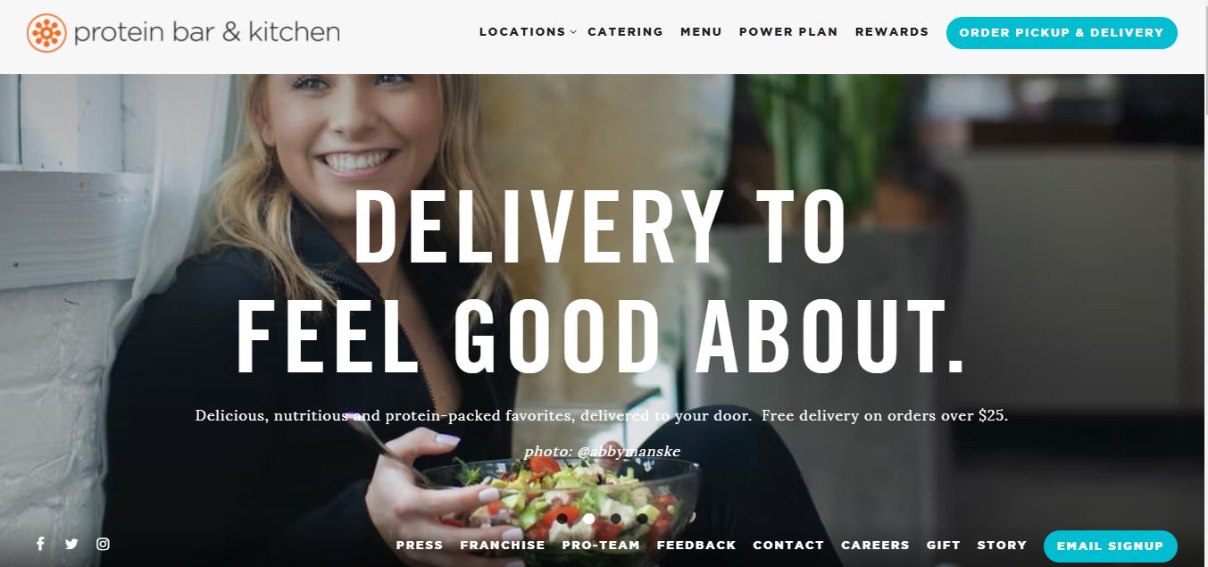
Do you own or manage a multi-unit restaurant? This website is highly recommended to draw design inspiration for your proposed website. Available in 15+ locations, Protein Bar & Kitchen creatively connect their brand together on one site, making it easier for prospects to discover any of their restaurants.
This restaurant website also features an excellent color palette, a sticky navigation bar, and parallax effects.
15. Eleven Madison Park
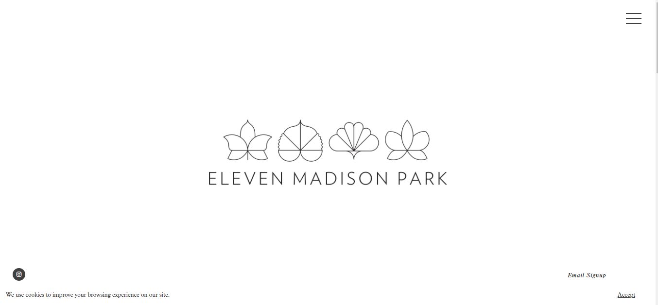
Finally on our list of the best restaurant websites is the Eleven Madison Park restaurant website design. This site proves that simplicity isn’t boring.
The brilliant use of whitespace eliminates possible distractions, ensuring visitors focus on the visual information conveyed. Eleven Madison Park also includes an appealing hamburger menu that connects visitors to other site parts.
Learn how to create a responsive hamburger menu for your restaurant website.
Elements of Great Restaurant Websites
This is the list of elements that any restaurant website should include:
-
Meals menu: this is essential for any restaurant. Your visitors will probably want to see what the restaurant offers and see if it’s something they are interested in. If you add a menu, make sure to keep it up to date.
-
High-quality food images: seeing the menu is great, but seeing pictures of the actual food your restaurant provides, that’s a totally different experience. A good selection of images will for sure have a much greater impact on the visitor than just a text menu. Make sure they are high-quality images taken by professionals. This will make the difference.
-
Pictures or videos of the restaurant: when we visit a restaurant we usually don’t do it just because of the food, but also because of its atmosphere. A good-looking restaurant will be much more appropriate for business meals, dates, etc. While a more traditional one can be perfect for a night out with friends. Make sure to provide pictures of the place. People don’t want surprises.
-
Restaurant awards or ratings: if the restaurant has any awards, make sure to add them to the website. And if not, you can use ratings from well-known websites such as Trustpilot.
-
Location or map: make sure to make it easy for visitors to see where the restaurant is located. Add the address and if possible Google Maps.
-
Phone number: adding a phone number will make it easier for people to contact you for quick queries or to book a table. Even you can add a booking feature to the website, many people still prefer to talk to a human to avoid possible issues or misunderstandings.
-
Book table service: young people are used to doing things online and if they can book a table directly from the website, many will love it. It’s not a feature for all, but it’s something that adds more value to the website and that can potentially save time to restaurant workers.
![21+ Best Artist Portfolio Examples [Get Inspired!] artist portfolio websites share](https://alvarotrigo.com/blog/wp-content/uploads/2023/08/artist-portfolio-websites-share-300x150.png)
![30+ Best Church Website Templates [WordPress & HTML] church website templates share](https://alvarotrigo.com/blog/wp-content/uploads/2023/08/church-website-templates-share-300x150.png)
![18 Great Podcast Website Examples [Get inspired] podcast website examples share](https://alvarotrigo.com/blog/wp-content/uploads/2023/08/podcast-website-examples-share-300x150.png)

![9 Best Wellness Websites To Get Inspired [Examples] wellness websites share](https://alvarotrigo.com/blog/wp-content/uploads/2023/08/wellness-websites-share-300x150.png)
