Have you ever noticed that whenever you have two main options in a particular area, people end up with strong opinions about which is best?
CSS Grid Vs. Flexbox! is just one of them, but think about other
examples like Pepsi Vs. Cola, PC Vs. Mac, Burger King Vs. MacDonald’s.
Surprisingly (to me at least), people do get a little bit tribal about this! Some people say CSS grid is the best thing since sliced bread. Others think flexbox takes the biscuit.
But the truth, as always… is somewhere in between. Read on to learn all you need to know about these tools (and bust a few myths along the way!).
What are the differences between flexbox and grid?
The main differences are the following:
- Grid puts layout first
- Flexbox puts content first
- Grid deals better with overlapping
- Grid is setup mainly on the parent.
- Flexbox is setup mainly on the children.
But let’s get into more details now.
CSS Flexbox Vs Grid: Is Flexbox One Dimensional?
Let’s start with something you’ll hear everywhere – CSS flexbox enables you to control layout along one dimension, while CSS Grid enables you to control layout in two dimensions.
Is this really true? Well, I suppose technically it is, since with flexbox you have to make a choice between a row or a column with your flex-direction. But elements can wrap onto new rows/columns:
Unless your screen is very wide or very narrow, you’re going to see a two-dimensional grid there. Yes, it’s a single line wrapped onto multiple rows (much like the paragraph you’re reading right now), but it certainly looks two-dimensional to anyone looking at it.
But things can get dicey with more complex layouts. Say you wanted three columns of boxes – a wide one in the middle, and two thin ones on either side.
You can do that in a single flexbox. You could use percentage widths, and have separate classes for the wide and thin elements. That works OK on wide screens:

But you can run into trouble if the screen isn’t as wide as you hoped:

And here’s the Pen for that one:
Note here, that CSS flexbox has given the content more importance than the layout. Our three-column layout wasn’t explicitly defined in the code – it emerged because we sized the content in such a way as to create it. Therefore, the browser maintains the size of the elements when they wrap – with undesirable results.
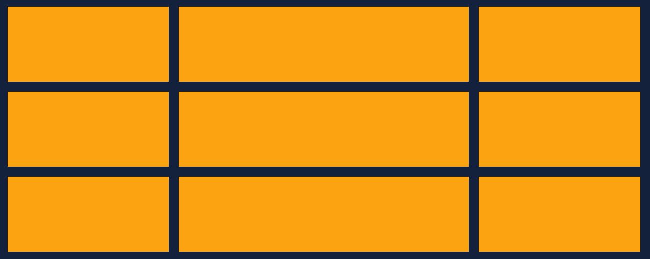
This just isn’t a problem you’d run into with CSS grid. You’d set the boundaries of the columns, set your gap, and you’re done:
display: grid;
grid-template-columns: 1fr 2fr 1fr;
gap: 20px;
grid-template-rows: auto;
Code language: CSS (css)
That layout, alignment and spacing will hold their shape no matter what. There will be no unexpected surprises down the line because the content will adjust to fit your grid specification.

So here’s the key distinction in the CSS Flexbox Vs. Grid debate:
-
Grid puts layout first. Grid will take your content, and change its shape so that it fits your desired layout.
-
Flexbox puts content first. Flexbox will take your layout, and change its shape so that it fits the desired size of your content.
That’s what people mean when they say flexbox is one-dimensional. It can align elements to a pixel-perfect level along one dimension, but as soon as it wraps, things can go wrong.
But… Can’t You Just Use More Than One Flexbox?
Great question! Glad you’re paying attention.
Yes, of course, you can.
Here I simply used multiple flexboxes to mimic the three-column grid layout.
And this is what kinda bugs me about people insisting that grid is better than flexbox or vice versa. In the majority of use cases, both will work perfectly well.
Let’s try another example.
CSS Grid Vs Flexbox: Which One Is Best for Page Layouts?
Another thing you’ll hear all the time, is that you should use CSS Grid for larger areas, like the layout of a whole page, and CSS flexbox for smaller areas, say, a menu bar.
Although that’s not a horrible rule of thumb, it’s not strictly true.
You can use grid to control the layout in smaller elements like menu bars. It’s just that with grid, the layout of the elements takes more importance than the size of the elements themselves. If you want to lock the position of your menu elements in place, grid would be great for that.
And of course, you can design huge, complex, page layouts with flexbox. I mean, Bootstrap has proven that pretty convincingly.
If you are considering using a CSS framework, then you must check out our list of the best CSS frameworks.
And indeed, there are reasons you might prefer to use the flexibility of flexbox for page layouts, instead of the almost military strictness of grid. For example, if some of your content can vary in size from page to page, CSS flexbox may well be the better option!
However, it’s possible to build more flexible layouts with grid, so that’s not a hard-and-fast rule either – although it’s probably fair to say that it’s a little harder than with flexbox.
What About Simplicity and Elegance?
When it comes to larger layouts, however, you could make the case that they are easier to create in grid than they do in flexbox. It often takes less code to do the same job, and the code itself is perhaps more elegant (although that’s a little subjective, I know).
Take something like this:
A very simple CSS grid layout, with a header, two sidebars in the content section, and footer.
This entire layout is managed by one container, which I have used my incredible creative powers to name ‘container‘:
.container {
  display: grid;
  grid-template-columns: 1fr 1fr 1fr 1fr;
  grid-template-rows: auto;
  grid-template-areas:
    "header header header header"
    "left-sidebar content content right-sidebar"
    "footer footer footer footer";
}
Code language: CSS (css)
The grid has four columns, and you adjust their relative widths with grid-template-columns.
Then grid-template-areas tells you what fills each space in the grid.
You can appreciate the simplicity there, right? This makes it incredibly easy to manage and control the page’s layout and makes everything line up perfectly.
But Hang On, CSS Flexbox Can Do That Too!
I knew you were going to say that.
Yes, you’re right – the above layout is trivial to reproduce using CSS flexbox:
We just use three flexboxes – header, container, and footer. Each one is a separate row in the layout (of course, you can also use flex-direction: column; to control the position of columns – for example, the two sidebars could be flex columns.
And the result is the same.
There isn’t a strong reason to pick one over the other in simple layouts like this – they both do the job equally well.
We Often Prefer What We’re Used To
In my humble opinion, if people were being really honest, they’d admit that they just use the tool they are most familiar and comfortable with!
If you already know how to make a page with CSS flexbox, you might not want to put the effort into learning CSS grid. You can make pages pretty fast already, so why spend time learning a new approach when you already have a system that works?
Likewise, if you were a graphic designer before you got into development, you might find CSS grid more intuitive as you’d have likely spent a lot of time designing around grids in tools like Illustrator. You’d understand the ‘language’ of grid better, perhaps. Why bother learning CSS flexbox, why not keep leveraging the knowledge you already have?
I’d argue there are good reasons to take a walk down the other path…
CSS Grid Vs CSS Flexbox: Which Should I Use Then?
As a general rule, use grid if the layout is more important than content. And use flexbox if the content is more important than layout.
Do you want to create a strictly aligned, grid-based layout that remains the same regardless of what content its elements contain? Are alignment and order important to your brand, or to the look and feel you want to create? Well then, CSS grid might be for you.
Do you want more flexibility in your layouts? Do you want to put more emphasis on your content, and shape the layout of your site around it? Or are there unknowns in your content – how much you’ll have, how large the images will be, etc.? In that case, give flexbox a go.
But as I’ve tried to emphasize, neither tool is rigidly stuck inside these philosophies.
Great developers are ones who learn to use their tools in ways that you wouldn’t necessarily expect.
Before we had CSS flexbox, we were making layouts with float (and what a pain in the arse that was). Before that, it was HTML tables. Before that people used transparent gifs as spacers between elements (seriously!).
By learning different approaches and experimenting, people were able to build things others couldn’t.
So perhaps an even better answer to “Which should I use?” is:
Whichever you’re least familiar with!
Hands-on practice is the only way you’ll get a feel for which approach to use in which situations. So if you’re new to grid, use it on your next project. If you’ve never done a page layout in flexbox, try it.
The Myth of the Vs. Battle
Remember also one simple yet often overlooked fact – you don’t have to pick one tool and be stuck with it – you can use both!
That’s one advantage that the CSS Flexbox Vs. Grid debate has over the other two-horse races I mentioned earlier, like Burger King Vs. MacDonald’s. I mean, you can hardly put a Big Mac in a Whopper, can you? (actually, wait… can you? Hold my beer…)
You get my point – you don’t have to choose one over the other. You can use both, together.
OK, if you’ll excuse me, I have a couple of burgers to buy.
Before I go though, let me tell you one last thing. There is another approach you can take to creating website layouts – use a library, and let it do all the hard work for you!
For example, fullPage.js is a JS library that enables you to make super cool full-screen scrolling websites. You can set up smooth animations that move people from one page to the next, and it integrates easily with the other frameworks and CMSs out there, including WordPress (Elementor or Gutenberg) and React.
Companies like EA, Sony, and the BBC use it, so if you want to give it a try, rest assured you’re getting the real thing here. There are some examples here of what fullPage.js can do – have a look, see what you think!

![9+ Delicious Bakery Website Ideas And Examples [Get Inspired!] bakery websites share](https://alvarotrigo.com/blog/wp-content/uploads/2023/08/bakery-websites-share-300x150.png)
![11 Must-Have Skills If You Want to Be a Web Developer [2024] web developer required skills share](https://alvarotrigo.com/blog/wp-content/uploads/2023/08/web-developer-required-skills-share-300x150.png)
![13 Best Embroidery Software for Mac [Ranked & Reviewed] embroidery software mac share](https://alvarotrigo.com/blog/wp-content/uploads/2023/08/embroidery-software-mac-share-300x150.png)

