If you looking for inspiration or ideas for your podcast website we will be helping you in this article. We’ve gathered a great list with examples of beautiful podcast websites.
While a website helps significantly to build a loyal audience for your podcast, it can also be a brilliant tool for reeling new listeners in.

Checking out other podcast websites is always a nice thing to do when designing yours, so pay attention to these great podcast website examples and enjoy!
Top 18 Podcast Website Examples
1. Gabby
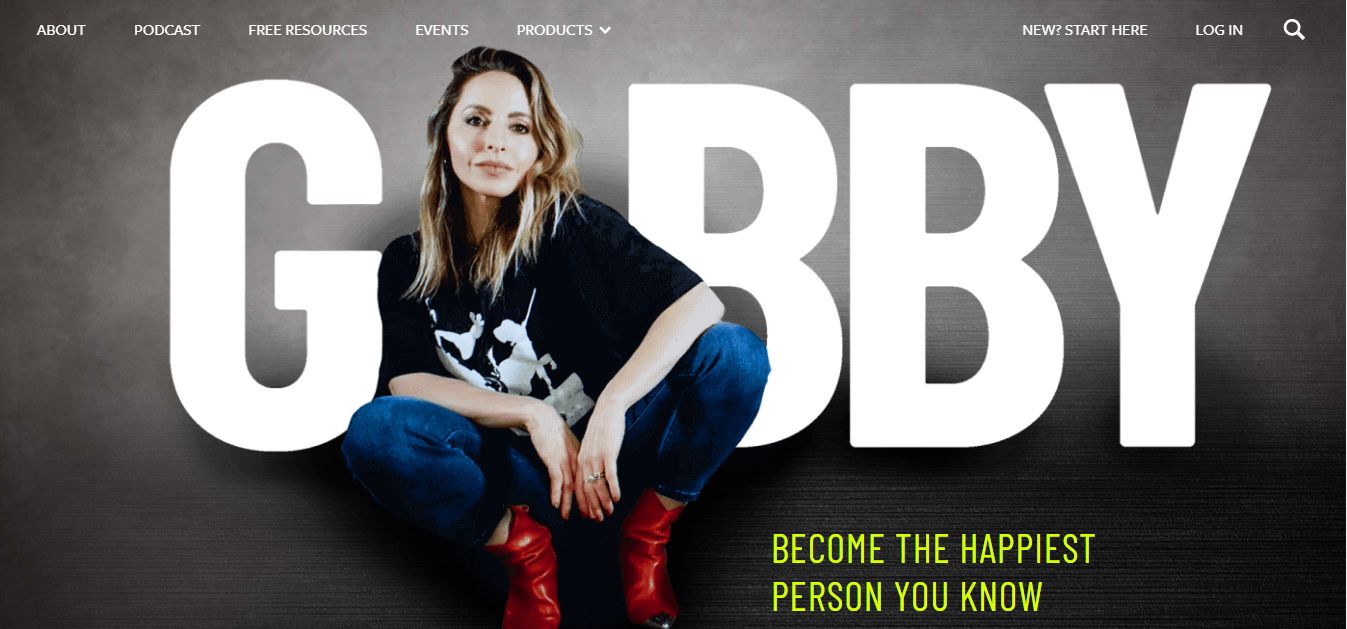
Bold typography and multiple CTA buttons are the major features of this podcast website example. Gabby includes a sticky menu that aids easy navigation throughout the website, allowing visitors and listeners to quickly find what they seek.
If the sticky menu bar featured on this website catches your fancy, you can learn more on how to create a sticky navigation bar for your podcast website.
The color palette combined with the brilliant use of whitespace creates an amusing user experience, ensuring your visitors spend more time on your website.
2. Dixie
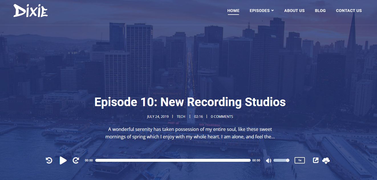
Let your listeners find the most recent episode of your podcast as soon as they land on your website! With Dixie, you can be sure of having your new visitors and loyal listeners immersed immediately, thanks to the layout of the latest episodes carefully arranged at the center of the page.
The dropdown menu at the top of the page and the comprehensive footer section ensure easy navigation through the various episodes available on the site. Dixie also includes social links.
3. Meditations
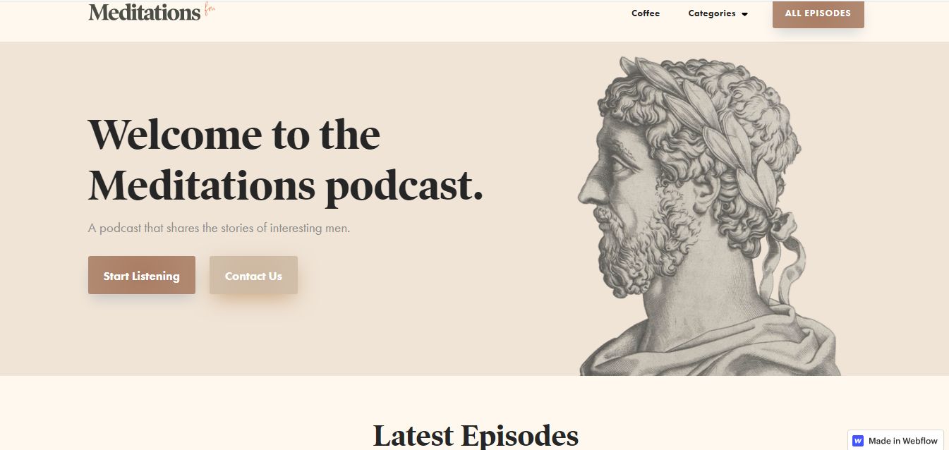
The Meditations podcast website is characterized by multiple CTA buttons – it’s an approach that allows you to lead your visitors in your desired direction. Right from the header section of the website, the website lets listeners know what to expect before even deep-diving into other sections of the site.
Meditations website is created with Webflow. It includes multiple social links on the footer section, allowing your visitors to choose their most preferred podcast directory for the best listening experience.
4. Jen’s Den
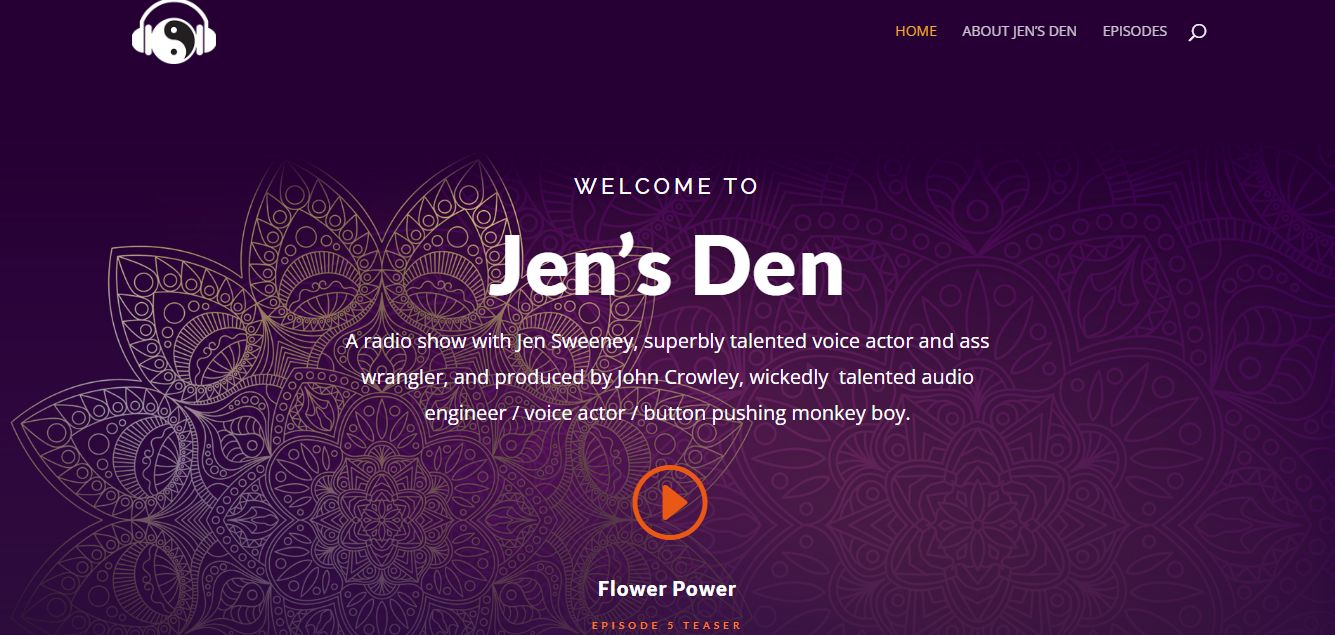
Jen’s Den is a relatively simple yet stylistic personal podcast website example featuring a brilliant use of color. The website layout explored offers an engaging experience, creating an adventure-like feeling in visitors throughout their stay on the website.
The multiple CTA buttons included on the site encourage listeners to take favorable actions, including subscribing to the podcast’s mailing list.
5. History of WWII Podcast
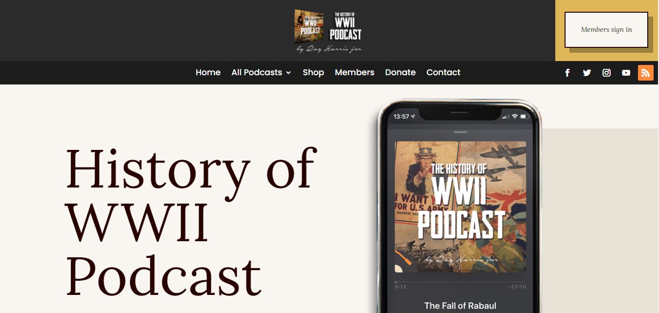
History of WWII Podcast website features classic and modern web design elements, including subtle on-scroll animations that ensure an overall immersive experience.
The bold typography alongside the user-friendly menu options included at the top and bottom of the page aids easy navigation around the website, including the donation page.
This podcast website example also features multiple clear call-to-action buttons to encourage new listeners to subscribe. The well-placed social links also allow your listeners to choose where to listen to your podcast and share your content effortlessly.
6. After Dark Podcast
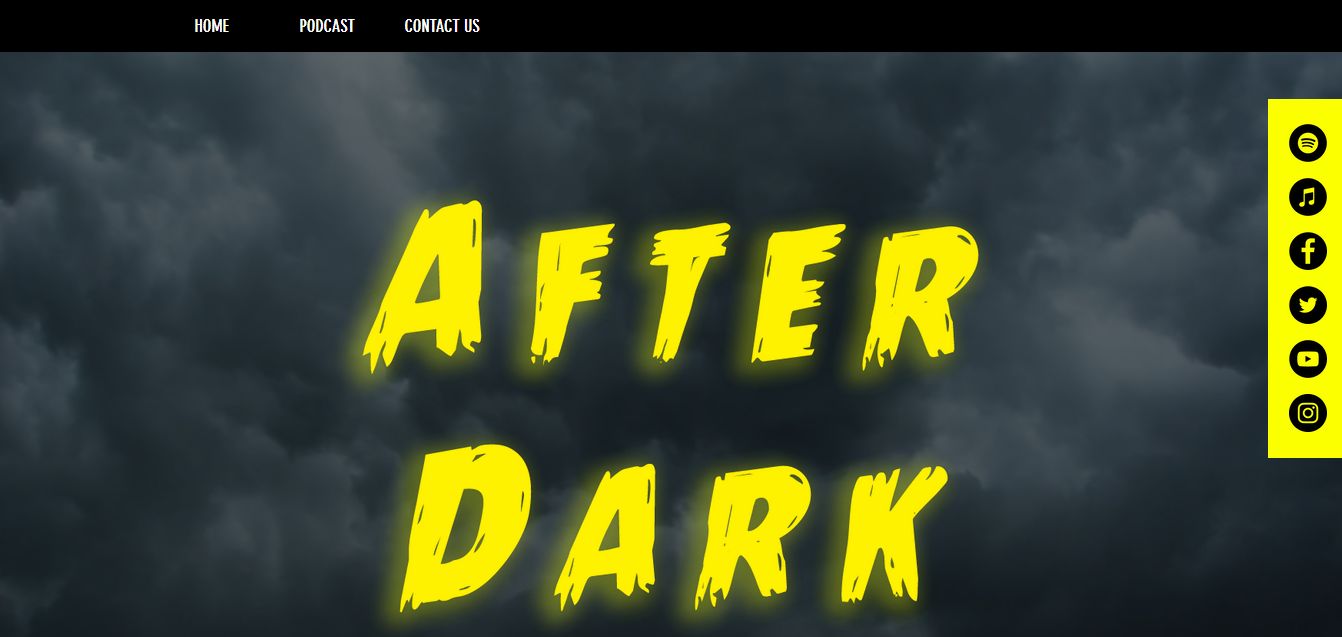
The color contrast used in this podcast website creates a comical and casual feeling for listeners.
The immersive background video blends perfectly with the site’s concept. The sticky menu added to the top of the page ensures easy navigation, letting your visitors find their choice episode or show very quickly.
After Dark Podcast also features sticky interactive social links that allow easy sharing on multiple social media platforms, including Instagram, Facebook, Twitter, etc.
7. Floodlines
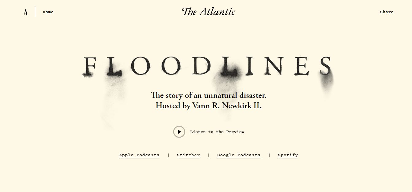
The Floodlines podcast website features several inspirational design elements. The interactive trailer video at the center of the website subtly introduces visitors to the available podcast series, preparing their minds for what is to come.
The cinematic theme explored in this website creates a thrilling adventure for listeners, enhancing the site’s overall user experience.
The website is generally easily-navigated; each episode on this podcast features inspiring branding that encourages your listeners to continue listening and ultimately subscribe to your podcast.
8. The NewsWorthy
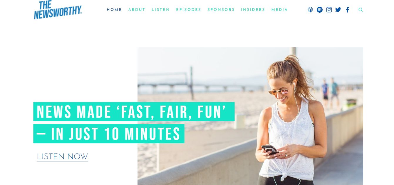
The NewsWorthy website features a minimalistic yet modern design with the dominant use of whitespace. This podcast website example establishes its credibility by including a “Listeners Reviews” section where listeners discuss their thoughts on your podcasts and topics that you address.
The “About The Host” section also lets visitors familiarize themselves with the podcaster while establishing the host as a credible, experienced, and knowledgeable persona they can trust to offer only the best content.
9. Being Boss
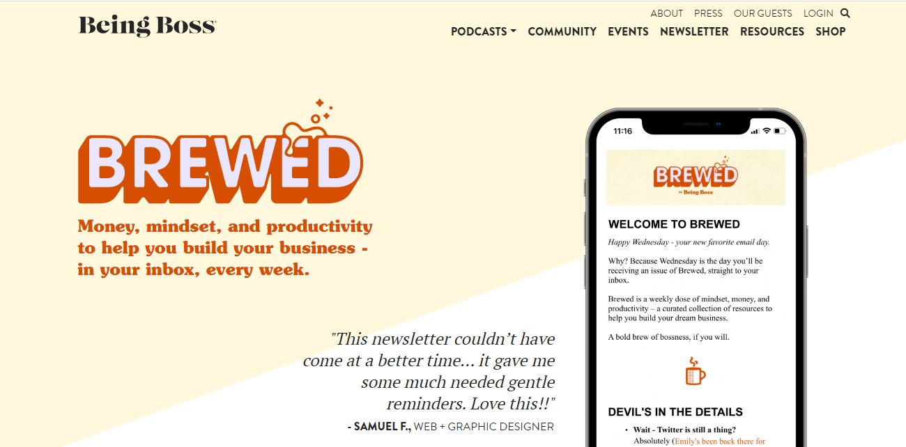
Another brilliant podcast website example worthy of consideration is the Being Boss website. Being Boss explores a consistent design that ensures easy navigation, making listeners quickly find their choice episodes.
The included social media sharable links enable your visitors to easily share your content on popular social media platforms.
10. Jocko Podcast
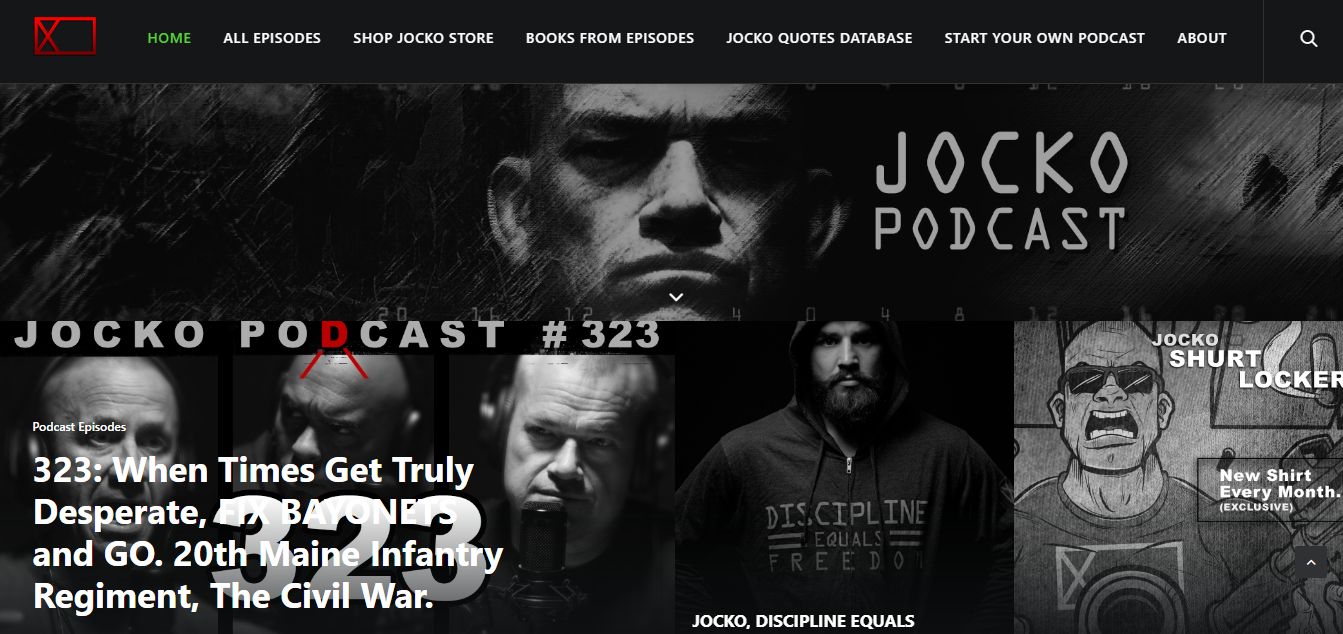
The thriller-themed grid layout explored created an adventurous cinematic feeling for listeners when navigating through your website. Jacko Podcast features a solid black background accompanied by greyscale images that creates a unique immersive feeling for your visitors.
11. This Week in Startups
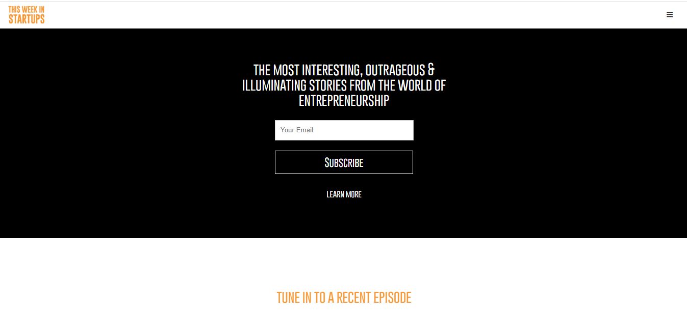
This podcast website design allows people to know what your podcast is immediately after landing on your site. This Week in Startups features a contextual and interactive banner video that welcomes visitors into the page before delving into the various episodes available.
This website also offers easy navigation, thanks to the hamburger menu included at the top right corner of the page. The prominent social media links also let your listeners share your content with their immediate social community, helping you generate even more listeners.
12. The Athletic Perspective
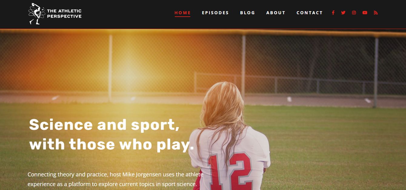
The Athletic Perspective podcast website will grab your attention instantly. It features a solid black background alongside a high-resolution hero image, creating engaging effects on listeners. The bold and powerful typography and color scheme employed also contribute to the site’s overall user experience.
13. 99% Invisible
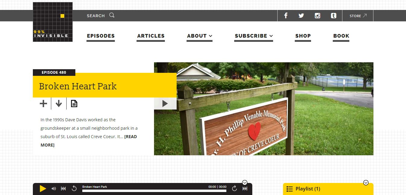
With an abundance of use of whitespace and well-displayed grid layout, 99% Invisible also passes a brilliantly-designed podcast website example useable for design inspiration.
The major element employed in this website is the filtering feature that allows your listeners to choose the content type and category they want. The included transcript also ensures user engagement while improving the website’s SEO rankings.
15. Twenty Thousand Hertz
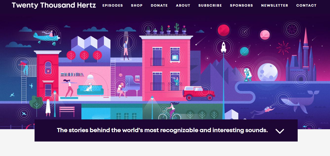
Twenty Thousand Hertz features a comprehensive, user-friendly menu section at the top of the page to aid easy user navigation. Inclusively, the well-positioned subscribe buttons added to the site aid you in building your audience base with minimal effort.
Although featuring a minimalistic design, the Twenty Thousand Hertz podcast website includes vibrant colors and beautiful illustrations, offering an engaging user experience for its listeners.
16. Smart Gets Paid
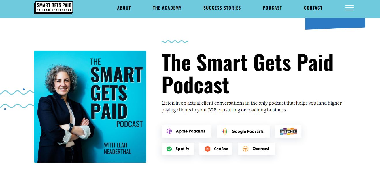
Featuring a grid layout alongside a brilliant color blend, the Smart Gets Paid podcast website offers a visually appealing and immersive podcast website. The hamburger menu added to the top-right corner of the page plus the sticky menu ensures easy users navigation, allowing our visitors to find what they seek almost immediately.
With multiple subscribe links, The Smart Gets paid podcast website example allows visitors to choose their preferred listening platform effortlessly.
17. The Smarter Sales Show

The Smarter Sales Show is a colorful podcast website featuring subtle on-scroll text animation, creating an amusing feeling for visitors. The sticky menu at the top of the website aids easy navigation, allowing your new visitors and existing listeners to find what they seek effortlessly.
This podcast website also includes an “About Us” section on the homepage to establish the podcaster’s authority and credibility.
18. Gameplay
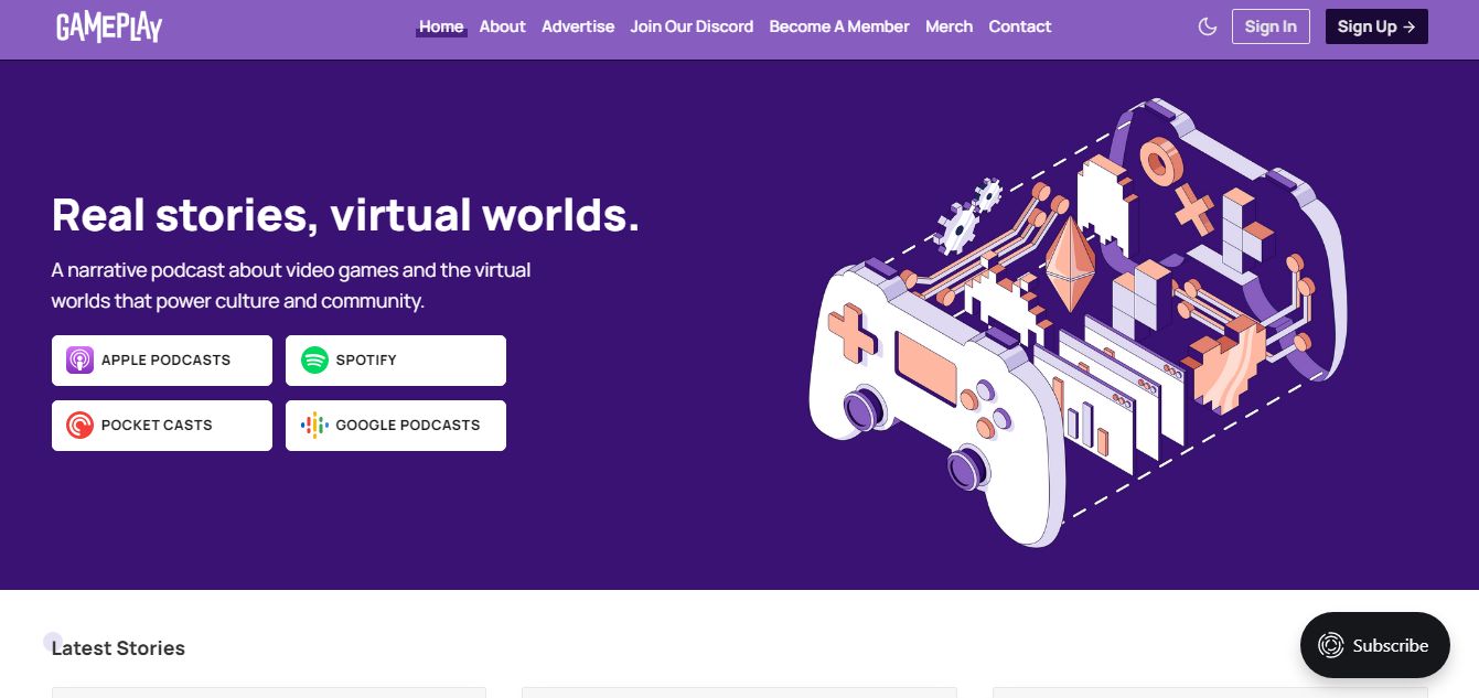
The Gameplay podcast website is the last on our list of the best podcast website examples for inspiration. This site creates an interactive and immersive visual experience for listeners, thanks to the beautiful color palette and unique illustrations explored in its design.
Another exciting feature of this podcast website is the dark/light mode toggle, an increasingly popular trend that several website developers now employ in their designs.
If you consider monetizing your podcast, the Gameplay podcast website is an ideal option for inspiration, primarily because of the pricing section included in its design.
Why Build a Podcast Website?

Because with a podcast website you can create a personal connection with your audience by streamlining your marketing channels and sharing original content. Below are the top reasons you need to build a podcast website.
- Streamline Your Marketing Channels: a podcast website allows you to combine all your marketing channels under one roof, including a contact form, email newsletter, social media profiles, etc.
- Share Original Content: it allows you to share original content, including videos, behind-the-scenes stories, show notes, etc., helping you engage your audience in the best possible way.
- Collect and Analyze Feedback Data: it helps you collect and analyze data, such as feedback and reviews, from your listeners, helping you get better at podcasting!
- Show Subscribe Links: you need a website to grow the subscribers for your podcasts on podcast directories, such as Spotify, Apple, etc. With well-placed “Subscribe” CTA buttons on your podcast websites, you can be sure of growing your audience on the platforms mentioned above.
- Monetization: you also need a podcast website to create an extra source of income. You can sell an eBook on your site, begin affiliate marketing, sponsor promotions, etc.
What Does a Podcast Website Need?
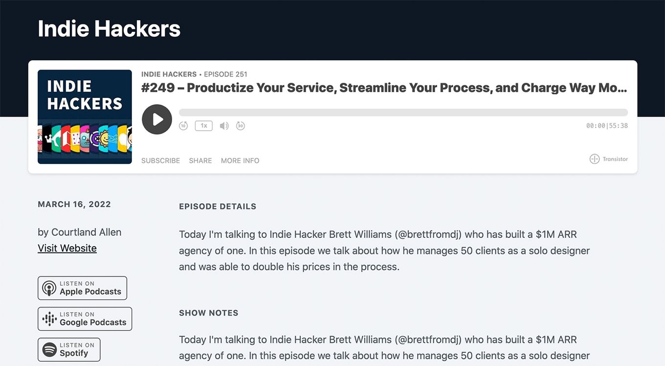
These are the main elements your podcast website needs:
- Audio Player: this is the most essential part of your podcast website. Without it, the website would make little to no sense. If you can provide one with configurable settings like the one to change the playback speed, skip or change the volume, that’d be even better.
- About us section: this is where you establish your authority in the niche, explain the aims and objectives of your podcast, including those it is for, why it is best for your visitors, etc. The description is typically short – about 2-4 sentences – but equally concise and compelling.
- Subscribe buttons: while attending to existing listeners, you must also cater to the needs of your new listeners. Including multiple subscribe buttons in your podcast website allows you to grow your audience base and subscribers list. Try adding multiple subscriptions to different podcast services.
- Testimonials: including a testimonial or review section in your podcast website allows you to establish your credibility in podcasting. With multiple listeners attesting to your expertise, you can be sure of having more persons becoming loyal listeners of your podcast.
- Social Share Buttons: Social Share Buttons allow your listeners to share your content with their immediate social media environment. Technically, it is another brilliant way to boost your social credibility, as many people tend to check the recommendations of your podcasts before granting you an audience.
Conclusion
And there you have it – the 18 best podcast website examples to draw design inspiration when designing your podcast website!
With the perfect podcast website, you can be sure of getting new listeners, promoting your site on other podcast directories, and connecting everything related to your podcast under just one “roof.”
![30+ Best Church Website Templates [WordPress & HTML] church website templates share](https://alvarotrigo.com/blog/wp-content/uploads/2023/08/church-website-templates-share-300x150.png)
![9+ Best Contact Pages To Get Inspired [+ 15 Free Contact Forms] contact page examples share](https://alvarotrigo.com/blog/wp-content/uploads/2023/08/contact-page-examples-share-300x150.png)
![9 Sites to Find Font Inspiration [Trends, Ideas and more] font inspiration share](https://alvarotrigo.com/blog/wp-content/uploads/2023/08/font-inspiration-share-300x150.png)
![20 Amazing animated Sliders [ Inspirations & Examples ] animated slider share](https://alvarotrigo.com/blog/wp-content/uploads/2023/08/animated-slider-share-300x150.png)
![Top 10 Aesthetic Websites [Inspiration for 2024] aesthetic websites share](https://alvarotrigo.com/blog/wp-content/uploads/2023/08/aesthetic-websites-share-300x150.png)
![10 Best Medical Website Design [Examples] medical website design share](https://alvarotrigo.com/blog/wp-content/uploads/2023/08/medical-website-design-share-300x150.png)