Looking for websites using the blue color? You’ve found the right place.
In this article, we will explain to you when should use a blue color scheme and then show you some great examples of different blue color schemes for websites.
What Is a Color Scheme?
A website color scheme is the collection of a designer’s color choices for their website design. Depending on how a website designer sees fit, the color combination may include various colors or just a few.
A website color scheme communicates the message behind a design, both on the psychological and visual levels.
Note that you will have to choose a primary, secondary, and accent color when creating color schemes for a new website. The primary color is usually the most significant, typically used for logo design, menu, and background colors.
What Is Blue Color Scheme Website?
A website with a blue color scheme is a website where the designs use the blue color as the primary color for the website. Usually to match the brand colors or to transmit certain feelings.
Blue is often considered the safest color choice.
In business, it represents honesty, trust, and dependability, thus building customer confidence, portraying one-on-one communication, making clients feel appreciated, and making them know they matter.
9 Examples of Websites With Blue Color Schemes
1. Evolve Health

The first blue website color scheme on our list of the best blue color schemes for websites is the Evolve Health Website. The website uses multiple shades, tones, and blue tints, offering flexibility. The brilliant blend of whitespace also improves the aesthetic quality of the website.
In addition, the website’s menu bar, located at the top of the page, aids easy navigation and enhances user experience. There are several call-to-action buttons placed at strategic places on the website that propels users to take favorable business actions, including “Login,” “Learn More,” “Meet Our Team,” etc.
The website also features an amusing review section as proof of credibility, building the confidence of prospective customers.
The website’s footer section features the company’s address for easy location, alongside their social media links for social credibility.
2. Swwim- Blue Website Color Scheme
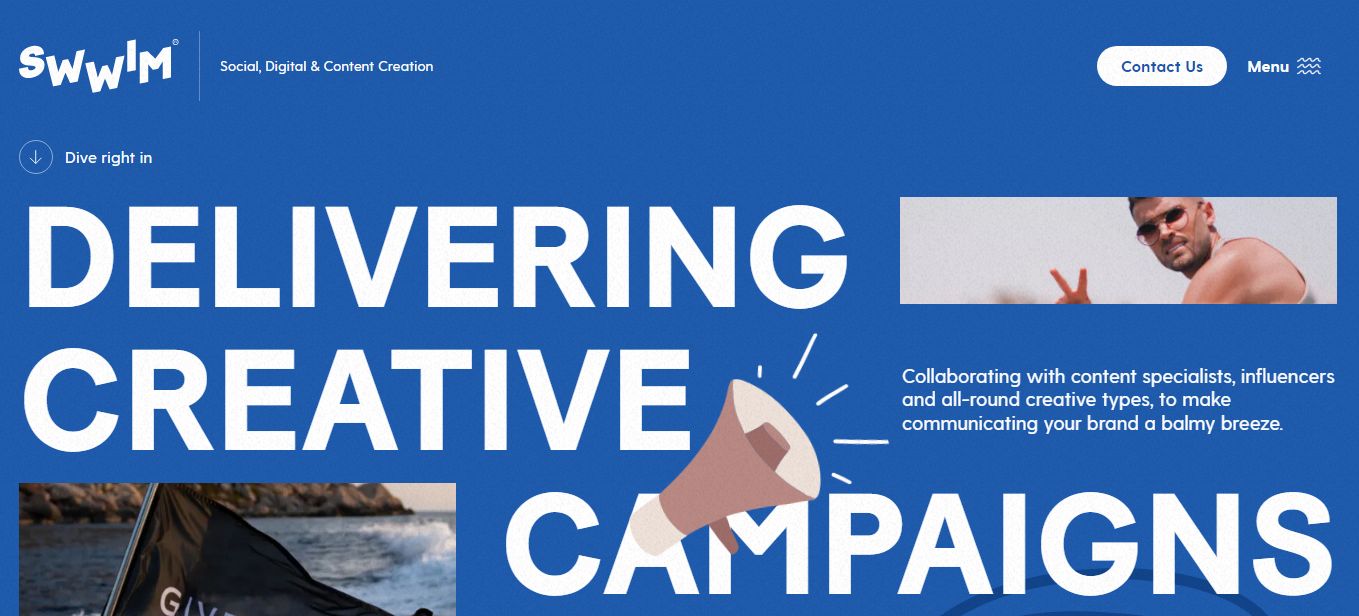
Swwim’s website uses a blue monochromatic color scheme, creating a sense of simplicity and harmony on the page.
A monochromatic color scheme refers to the use of only one color for website design. The accompanying bold typography allows users to focus on the most important parts of the site.
Swwim also includes a hamburger menu on the right corner of the page, creating an amusing effect while helping visitors quickly find what they seek. This high-end, stylish and subtle navigation menu does not overwhelm users with too many choices.
The website also features a mouse hovering effect, particularly on their CTAs, aiding user experience. There is also a “Welcome Note” section, an effective means of strengthening the line of communication between users and the brand.
3. Skyboat Advertising
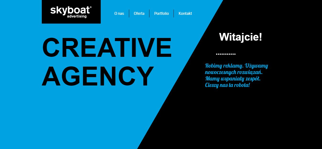
This website design pays attention to aesthetics; the most impressive feature on the Skyboat Advertising website is a splitting screen triggered as you scroll.
A drop-down menu at the top of the page indicates the section numbers as users scroll down. This is a splendid way of allowing users to keep tabs on their movement on the website and aids in easy navigation.
If you liked the drop-down menu explored on this website, here are 15 more amazing drop-down JavaScript menus that may catch your fancy.
Another section of the site contains pictures of the business managerial team to familiarize users with the organization.
Finally, the footer section of the page features the company’s business address, telephone number, and email address so their prospects can easily reach them beyond their website.
4. GoCardless
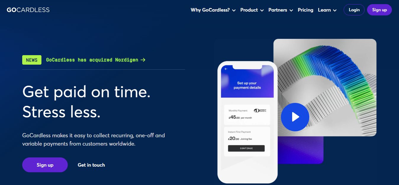
GoCardless website features a less cluttered layout. The site’s blend of blue and white background alongside the subtle scrolling effect implemented gives a royal feel while aiding a brilliant overall user experience, encouraging them to surf even deeper into the site.
The menu bar at the top of the page alongside the comprehensive footer section aids easy navigation and lets users quickly find what they seek.
5. Bench
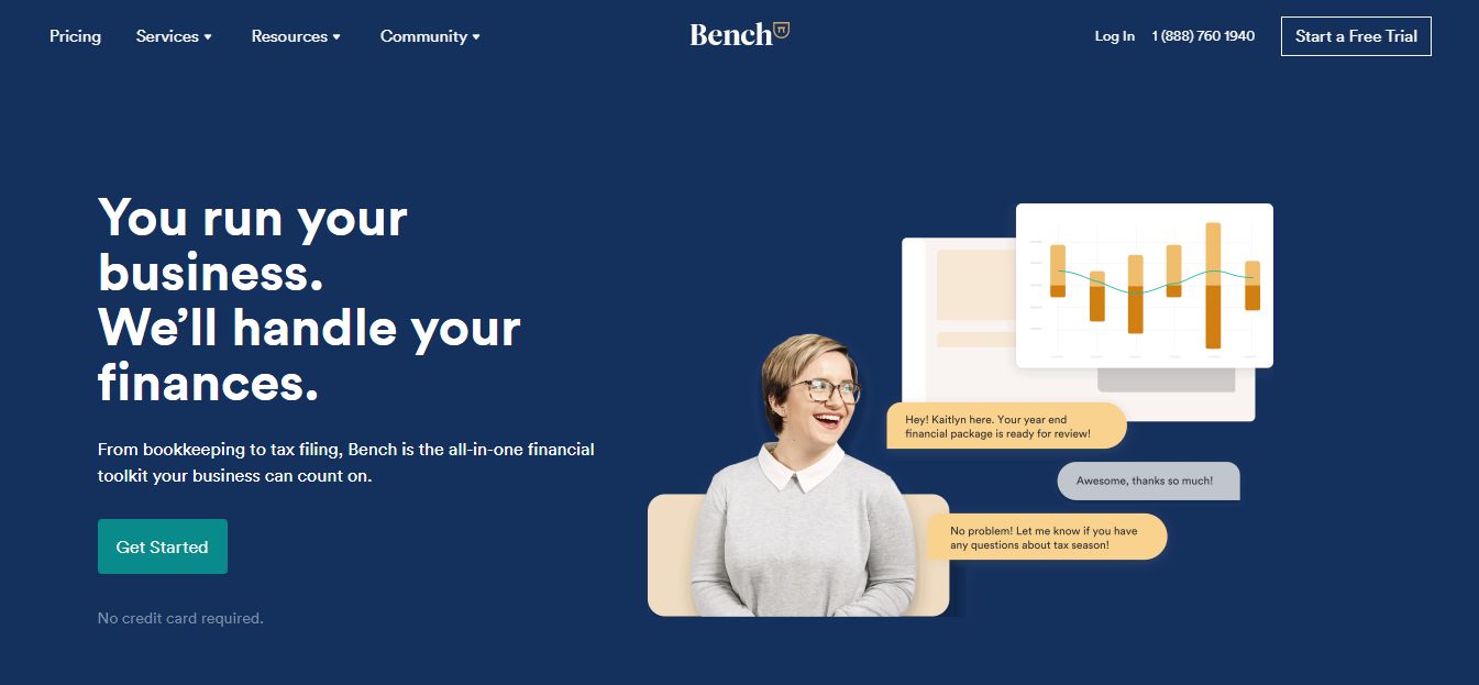
The fifth website on our list of the best blue color schemes for website for inspiration is the Bench website.
Featuring a variant of blue, white, and an accent green color, this website offers a unique website layout that’s both aesthetically pleasing and less clustered, allowing you to add as much content as possible without the risk of overwhelming your visitors.
Bench also includes a sticky menu bar for easy navigation – the comprehensive drop-downs incorporated in the nav bar also allow your prospects to find information quickly.
The partner companies included in this website show proof of credibility, encouraging prospects to do business with them. The social media links at the footer section also allow visitors to connect with Bench beyond the website.
The site features multiple strategically-placed call-to-action buttons that propel users to take favorable business actions, including “Set A Free Trial,” “Get Started,” “Login,” and “Learn More.”
6. Groove Commerce
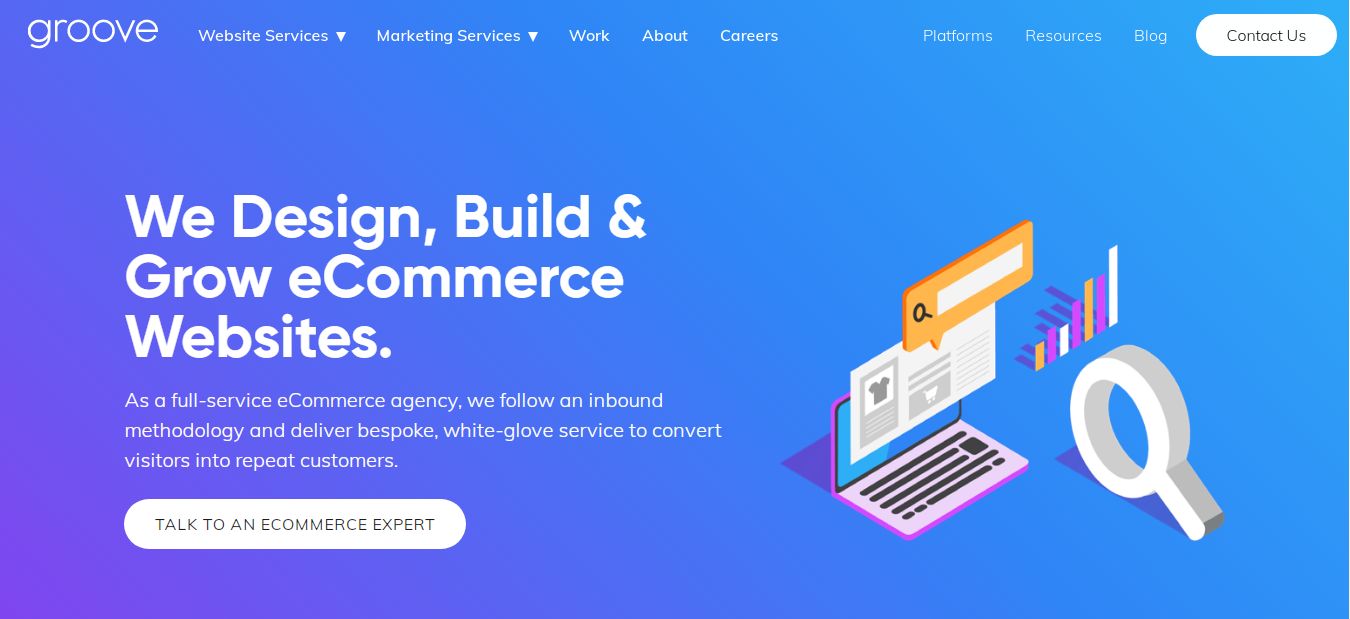
Groove Commerce’s website blends sapphire and dodger blue, creating a calm and dreamy vibe. More importantly, this website brilliantly controls the slight contrast in the various blue shades, creating a harmonious feeling throughout the site.
This business site also includes a sticky menu bar at the top of the website page for easy navigation.
Users can subscribe to the company’s email for further accessibility. The multiple CTAs, including “Contact Us,” “Support,” “Talk to An eCommerce Expert,” etc., allows users to connect better with the business while taking favorable business actions.
7. Turbulent
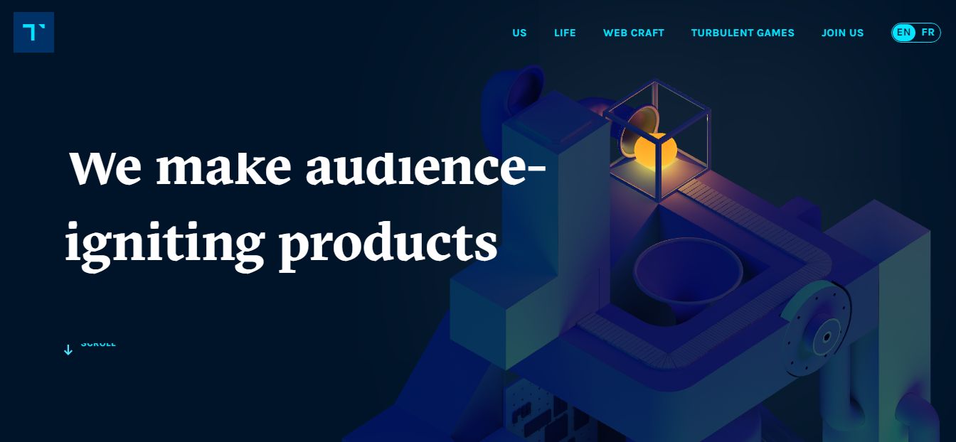
The website features a dominant denim blue color. The 3D background video creates a welcoming and amusing feel, ultimately enhancing the site’s overall aesthetics.
Like every other blue color scheme website on this list, the Turbulent website also features a mega menu bar at the top of the site for easy navigation. This is accompanied by a scroll icon in the header section encouraging visitors to scroll even further.
The bold typography explored perfectly compliments the color shade, ensuring optimal user engagement.
The footer section contains contact numbers and addresses of the brand for better accessibility. Social media links are also included in the page’s footer section for social credibility.
8. Latropolis
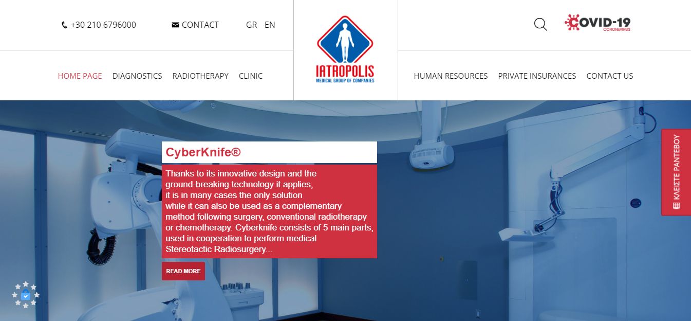
Latropolis features a minimal blue color scheme with abundant use of whitespace. This site layout is busy yet not distracting, thanks to the choice of font size and type, alongside the sticky menu bar that aids navigation.
This blue color scheme website also features a header video that grabs the attention of users immediately after they land on the site. In addition, the company’s contact number is carefully placed at the top left corner for visitors to have better accessibility to the management.
The multiple CTAs are used to allow users to take consumer actions without having to leave the site. Iatropolis also includes the opening and closing business hours for prospects to know when to reach out for business.
Social media links and an email newsletter subscription section are included at the bottom of the website for social credibility and access to further information.
9. Xero
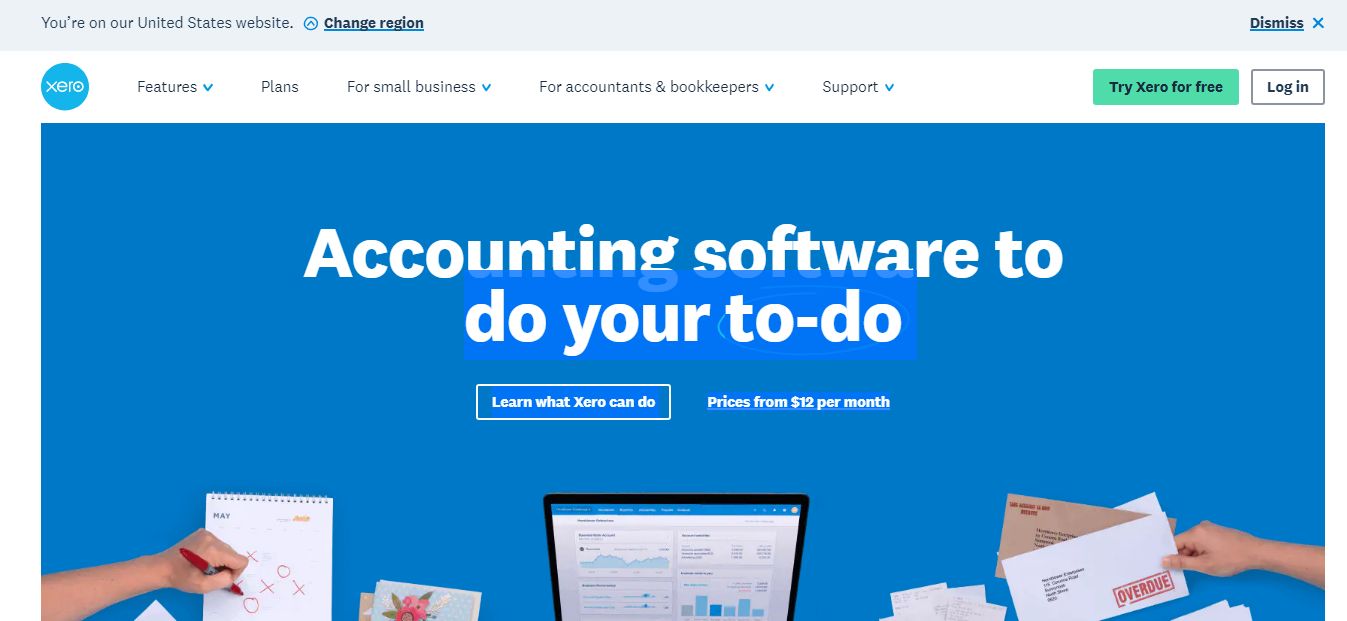
Finally on our list of the 9 best blue website color schemes is Xero! Xero’s website features a hero image on a blue background that immediately captures visitors’ attention and, more importantly, helps reinforce the brand and what they have to offer.
The business builds its entire visual identity around different shades of blue, all vibrant and saturated. The black headings and icons on the website equally compliment its design.
Social media links are also included in the footer sections for social credibility. In addition, users can visit the website’s blog, small business insights, and product updates pages to keep up-to-date with the company.
Users can “Start Using Zero for Free” by signing up for the email subscription. This strategy helps increase the business’s customer base.
Why Using A Blue Color Scheme?
When using the color blue in your brand, you can make visitors feel your business’ stability, peace, and calmness. Blue is reassuring and connotes financial security and confidence in the future. The blue color also represents professionalism, expertise, seriousness, and trustworthiness in business.
When used for images and text, the blue color reinforces the idea of trust in the financial aspect.
It is known that color plays a vital role in how your business is perceived. The right color choice will help you build a strong and relatable brand, ultimately helping you to better connect with your ideal customers.
Is Blue The Right Color For Your Website?
It depends on what you want to transmit to your users. Blue represents serenity; it expresses loyalty and stability. In addition, it is highly associative and a good choice for designers looking for various combinations.
If you are unsure about the best color for your website design, you should consider the color blue to help set the tone for your website and reflect your company’s values.
If you find this article helpful and interesting, share your thoughts in the comment section below.


