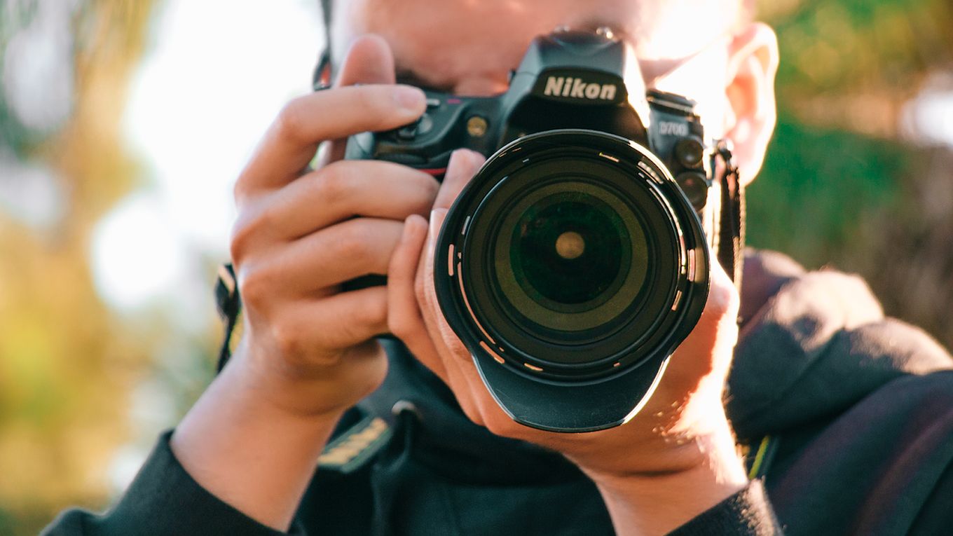
Imagination sparks the need to create a reality, and that’s exactly what pictures portray. As a photographer, it is important to showcase your photos online to show potential clients what their reality could look like through your lens. And that’s where a photography portfolio comes into play.
A portfolio allows you to display your best work, skills, experience, and techniques, such as symmetry, framing, and negative space. Additionally, a portfolio is a strong marketing tool since a prospect’s first interaction with your work heavily determines their likelihood of becoming a customer.
Keep reading to get inspiration for building your portfolio website. These photography portfolio examples should work regardless of your specialty.
20 Best Photography Portfolio Examples
1. Liz Andrews Photography
This is one of the most beautiful photography portfolio examples you’ll find. The whole website behaves like a full-screen slider, which is a clever and easy way to showcase a selection of your best images. You are showing your potential customers your work even before they ask for it, making it easier for you to convince them to look at the rest.
Each sliding section describes a type of photography (real state, weeding, corporate) and contains a link to another page with more details and pictures of those categories. It’s a clever, elegant, and simple solution for a website.
If you like this kind of page, you can easily replicate it by using the fullPage.js component. If you are using WordPress you can use the fullPage.js plugin for Gutenberg or Elementor editors.
2. Van André Rensburg Portfolio
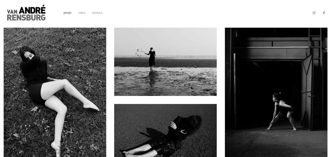
This portfolio combines a minimal design with black-and-white photography to achieve a modern look using a simple layout well-suited to the photographer’s style. It is an excellent example of creating a modern, story-like look while maintaining your style.
Using a simple layout and color scheme allows the viewer to focus on each piece of work individually. This way, the viewer can appreciate how well each image has been composed and what makes it unique. The dense grid layout and consistent theme, style, and color help the photographer present the entire page as one coherent body of work.
3. Aralani Photography
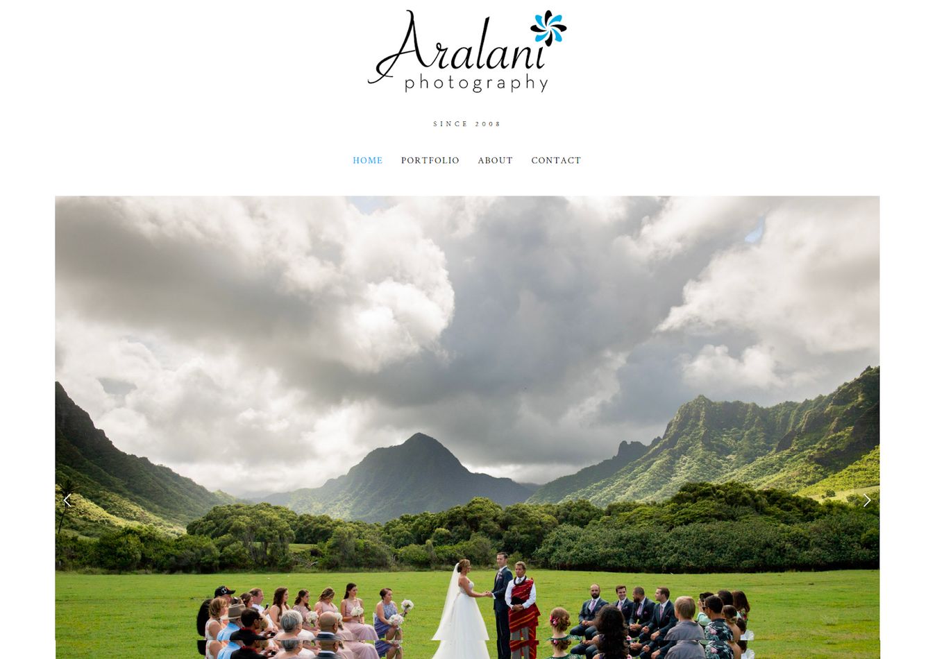
The first thing about this design is its main use of a slider. Once you open the webpage, a reel of images starts playing, but you still have the option to navigate the images. After scrolling past the main slider hero images, it starts presenting images using a grid system. This works well because it quickly shows clickable photos in a larger gallery.
To finish, this design uses the left-to-right design pattern to add long-form text sections for an “about me” section and long-form testimonials. It’s definitely another amazing portfolio example to get inspiration.
4. Kartsie Photography
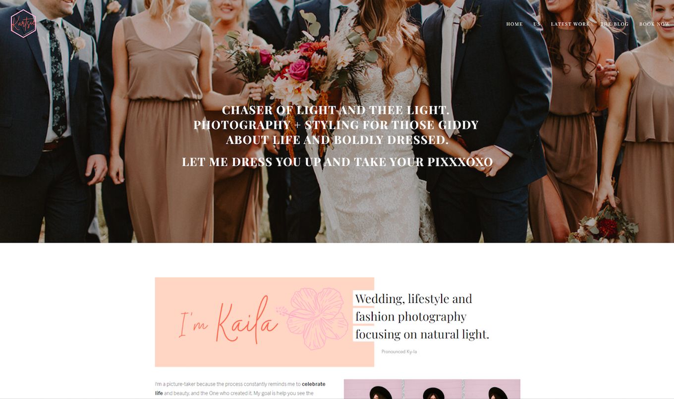
Here is a great sample of a hero image header. The large full-screen image in the header is a great background photo, and the centered text creates a focal point for the user. This example uses a static image, but it could be improved by auto-playing a range of hero images with a slight fade to show off more images in this section.
Once you scroll down a little, you can see that this design uses various layout techniques. First, it uses a left-to-right (zig-zag) layout and then a balanced asymmetrical design to create exciting whitespace and lines. This will help keep the page interesting and keep users engaged with the content.
If you are using Squarespace, check out this list of beautiful templates for photographers for Squarespace!
5. Olya Kobruseva
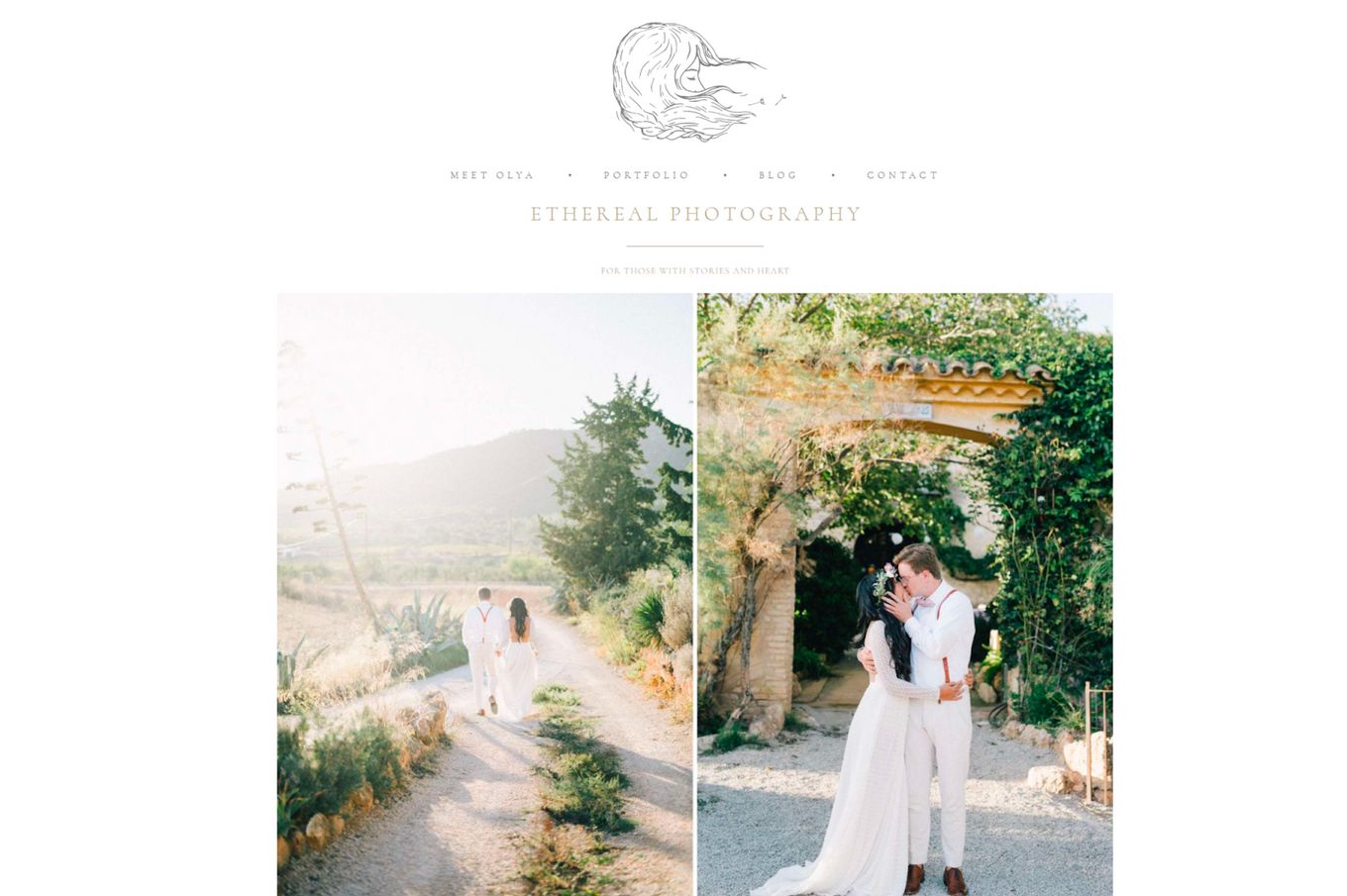
This portfolio is elegant and uses a minimal design to achieve a modern look. Right away, high-quality images are shown and begin to auto-play, not too fast that they become annoying, just right.
This website’s main gallery or portfolio pages use an elegant grid design, which works well with all the different-sized images. You can scroll through each gallery to easily navigate the page. The grid layout works well, and it is easy to get lost in the work being shown, which is good because it engages you.
6. Hardy Klahold
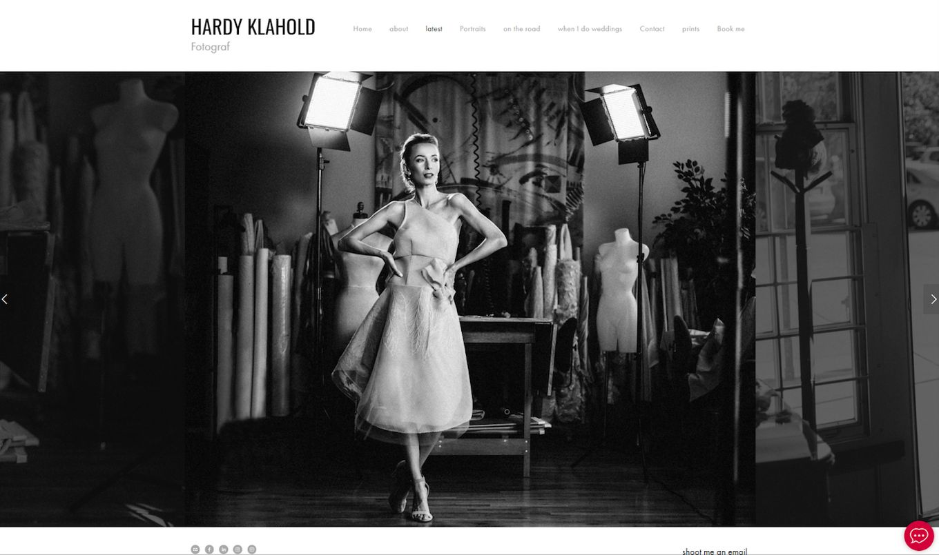
Upon opening the latest portfolio work, this site uses a full-screen slider design, allowing you to view full-screen images. The navigation bar at the top is always in view, making it easy to navigate to other pages.
This is a great one-page layout portfolio for photographers who have fewer images or like to be precise. Prospects can easily scroll right and left to see variations of a particular shoot. So, if you’re just starting, consider this portfolio.
7. Lauren Naylor
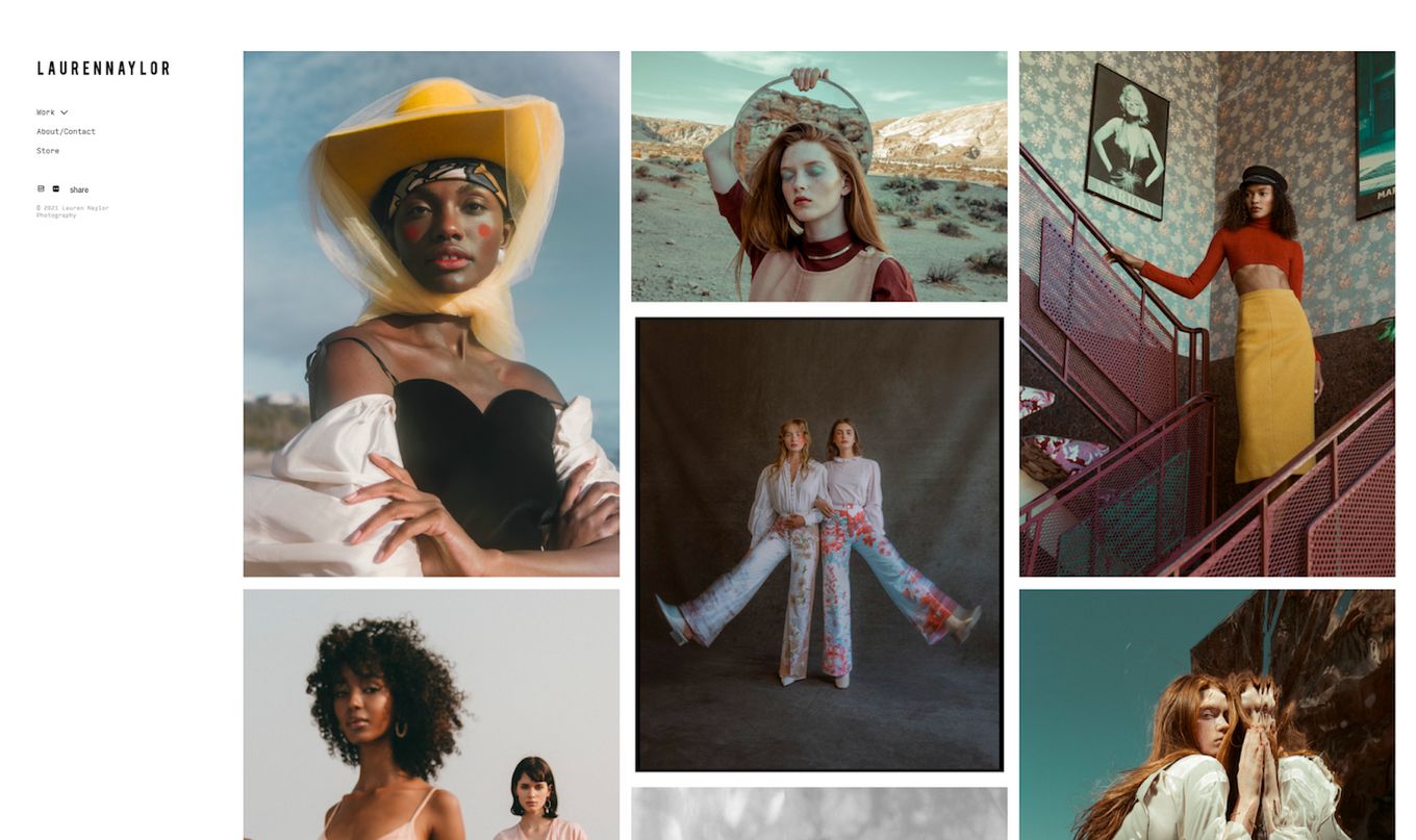
Getting a little different now. This design uses a fixed left sidebar for quick access to links. The main portfolio uses a grid to display an infinite scroll of images.
It’s good because the left-side menu allows users to stop scrolling after a long time and navigate elsewhere without having to scroll back up.
8. Carlos Hernandez
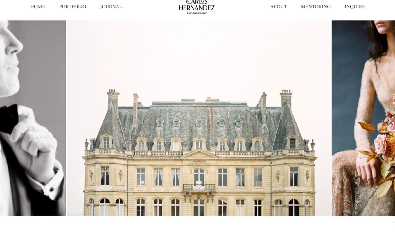
Here is one of the photography portfolio examples featuring different effects. When the page loads, a large hero header image is the main focal point, and the hero section acts as a slider.
Once you scroll down, the website displays a range of text and images and uses the parallax effect effectively to showcase images
9. Anchor & Lace
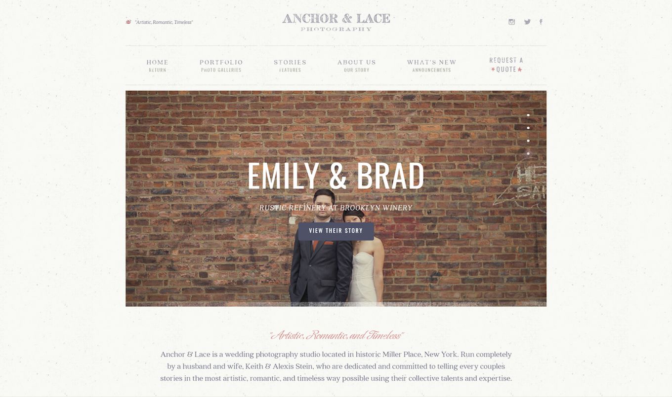
Using a textured background can be challenging, but this design does it well. The main focus is the header image carousel, which auto-plays a range of clickable galleries.
Each page/story has its design, but everything ties in with the overall concept. This portfolio design is a good option for photographers who like using words to amplify their photos.
10. Adam Von Mack
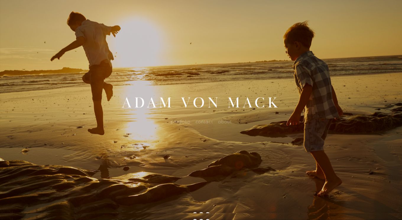
This is a simple but effective static hero image that navigates well. It is centered and looks elegant, giving it a professional feel.
Once you navigate to the main portfolio page, it uses a grid layout and side menu for easy navigation. The grid layout is very popular among these websites and works well.
11. Ravi Vora
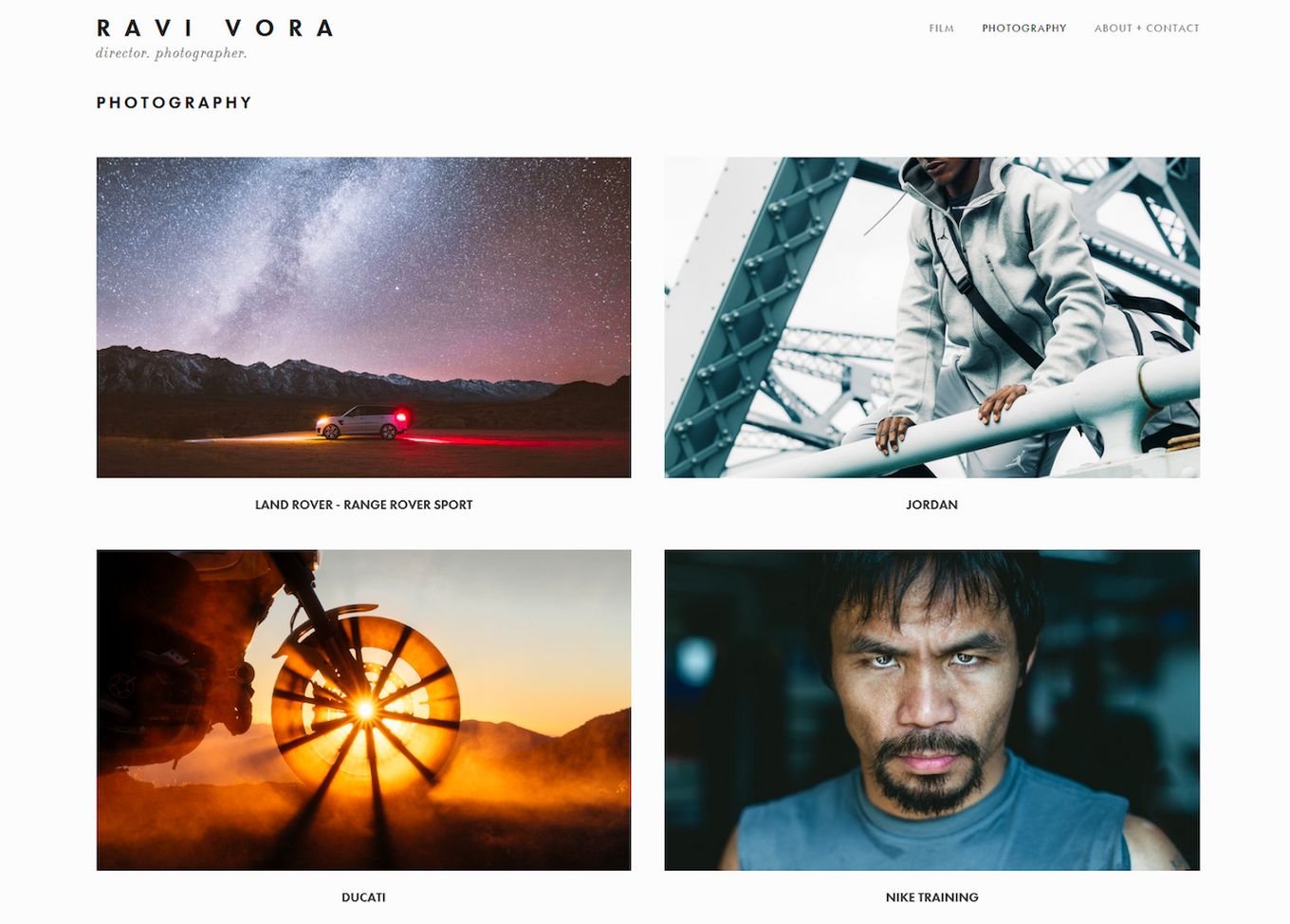
This portfolio uses a larger grid layout with more whitespace and is very easy to navigate. When you click a gallery, a more complex grid layout opens for that project. It works well and is very effective with a modern design.
The extra whitespace helps the images stand out even more, making them a great minimalistic example. The contrast between landscape and portrait orientation shots also showcases a photographer’s different techniques.
12. Love + Water
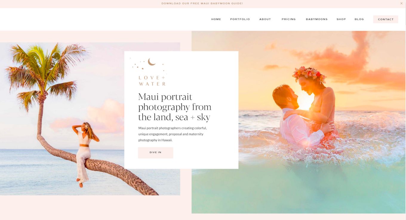
If you are looking for a perfect example of the split-screen layout, this is it! The layout is simple, and all the information, including the different galleries, is available on the front page.
It creates a professional look and is a great way to show off high-resolution images at scale. It is also a different way to create a hero image instead of just one large full-screen header.
13. Urban Photography
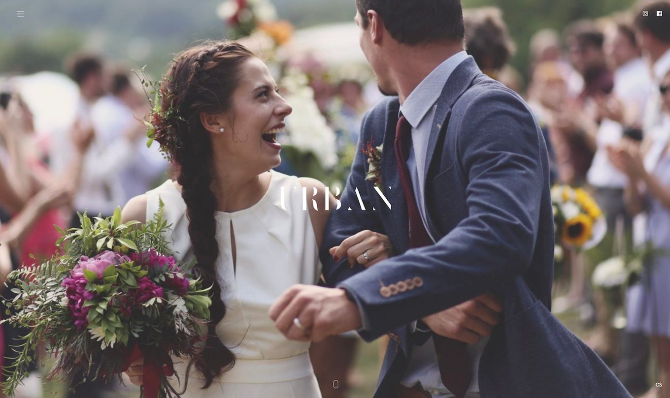
Urban photography uses a full-screen slider to tell a story as the user scrolls down. The whole website is a full-screen slider. When scrolling, the images blur, and text appears to explain the details.
While this portfolio is engaging and visually impressive, the contact information is right at the bottom, which may annoy some users with all the scrolling.
14. Nicolas Tarier
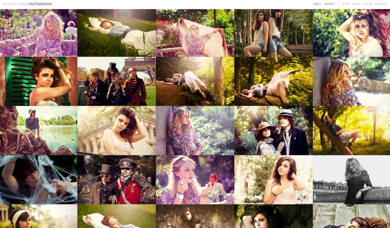
This site uses a different grid system. There are no gaps or whitespace, except for the header, where the navigation is. It is more of a cluttered collage.
This design isn’t for everyone but is very effective. The images are all the same size, and the mouse controls the scrolling when moving around. It’s a very different and interesting approach.
15. Zena Holloway
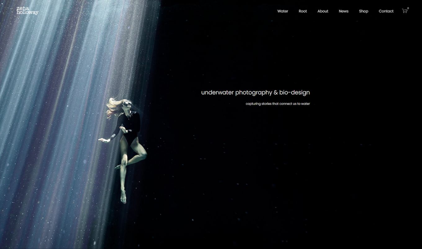
We have seen many different hero images before, but this one matches the design of the website header. The logo uses the hero image’s background as an amazing backdrop, and the header navigation is very visible in the black area.
When you go down, you are presented with a split-screen website layout with text below each image. These images make use of whitespace really well and it makes them stand out even more, creating a very powerful viewing experience.
16. Nordica Photography
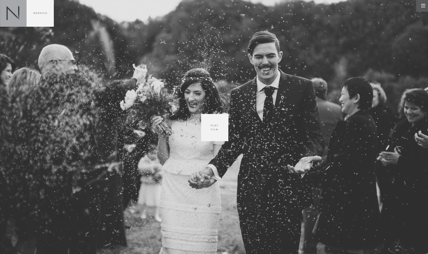
This portfolio is very creative and exciting to navigate. It starts with a large hero image header and a mobile menu to the right.
The site offers a map of the locations of different albums to click on. It is very different, and unlike the other photography portfolio examples, this design, if you have not noticed it, always keeps to a boxed style, from the logo to all the images and menu.
17. The Locals
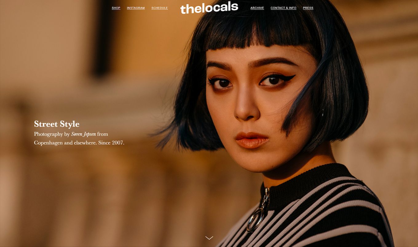
A stunning photography portfolio of a hero image header and a range of parallax effects.
It uses a grid layout combined with parallax, fading, and sliding effects. These may all sound annoying, but they work really well. Everything is smooth and loads quickly.
18. The Crawleys
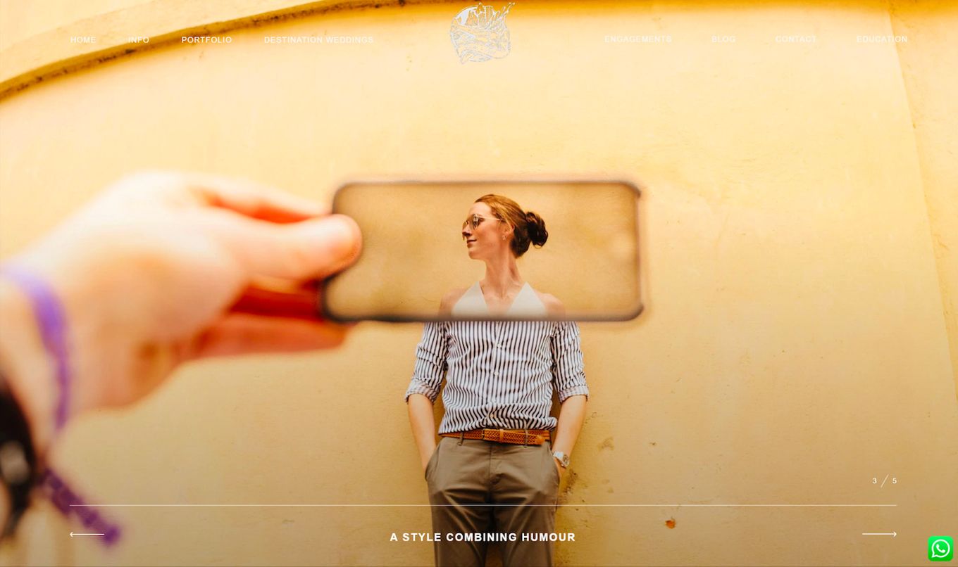
Here, a portfolio uses a full-screen image slider to showcase recent work and a short description at the bottom. The main navigation is part of the hero image slider. The images in the slider create a massive impact and statement.
Combined with high-resolution images and effective copywriting, this design is clean, slick, and modern.
19. Las Coleccionistas

Sometimes, images can feel a bit static, and not every design will feel exciting, but one way to make images more engaging is to use stop motion.
This website does exactly that: it showcases its work using stop-motion pictures. This is very effective and makes the content more exciting to look at. It combines amazing photography with interesting stories told through short, moving images.
20. Mitch Rouse Aerials
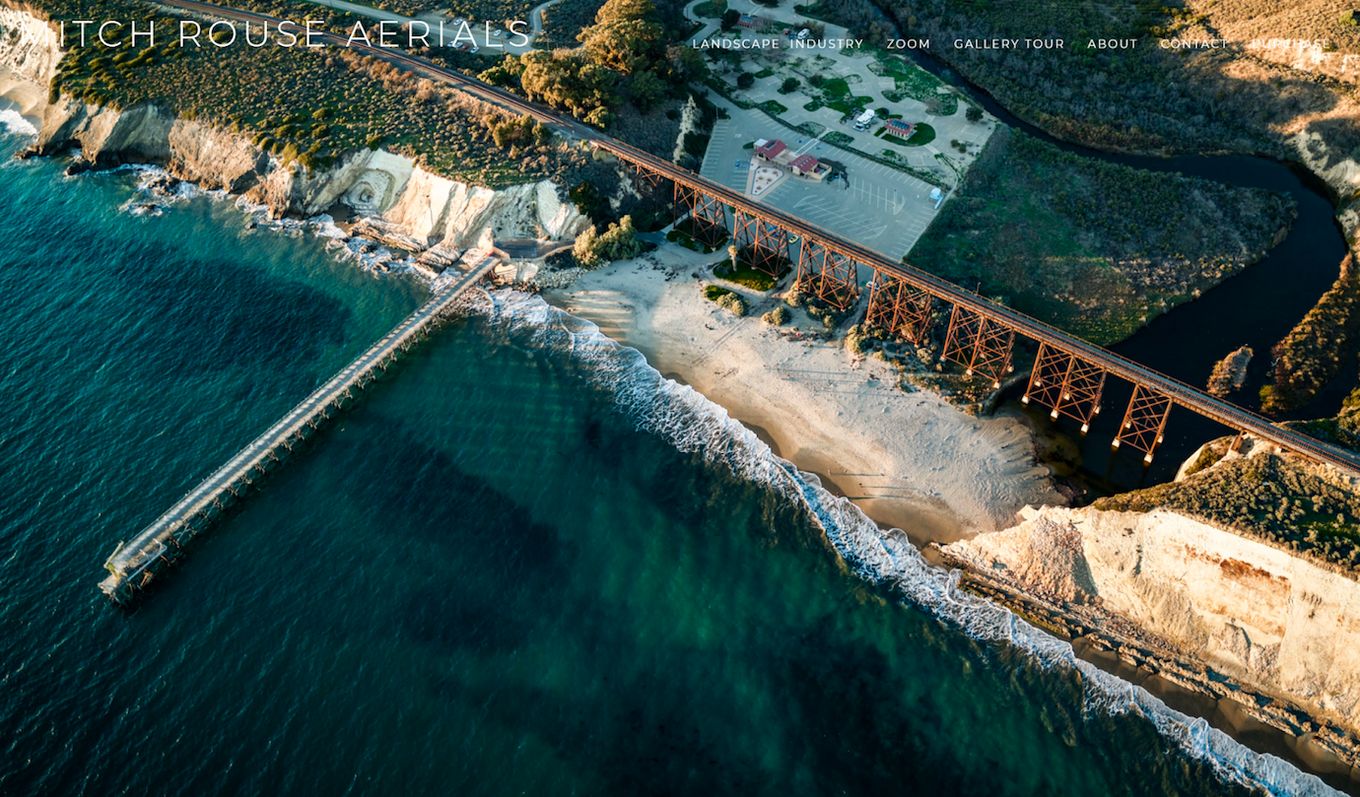
If you work with aerial photography, this website design shows how powerful full-screen images can be.
The Sweeping views from above work well with large hero images, capturing great detail in the pictures. The logo is just plain basic text but has a minimalist look and feel.
Photography Portfolio FAQs
What Should You Include in Your Photography Portfolio Website?
Your photography portfolio website should include high-quality images, contact information, captions, pricing, and testimonials from past clients. Add variations of your images, and different subjects to showcase your skills from all angles.
How Many Photos Should You Add to Your Portfolio?
You should add as many photos as possible to your portfolio. There isn’t a set limit. However, to prevent your portfolio from looking cluttered, stick to quality images. Also, let the layout you’ve chosen dictate the number of photos to use.
How Do You Make a Photography Portfolio Website?
To make a photography portfolio website start by choosing a photography website builder. Next, get a domain, select and organize your images picking out your best work. Include your pricing details and more information about yourself and your photography journey. The final step is optimizing the website for SEO to increase its visibility.
![15 Best Portfolio Website Builders in 2024 [Reviewed & Ranked] portfolio website builders share](https://alvarotrigo.com/blog/wp-content/uploads/2023/08/portfolio-website-builders-share-300x150.png)
![11 Must-Have Skills If You Want to Be a Web Developer [2024] web developer required skills share](https://alvarotrigo.com/blog/wp-content/uploads/2023/08/web-developer-required-skills-share-300x150.png)

![15 Great Squarespace Templates For Photographers [2024] squarespace templates photographers share](https://alvarotrigo.com/blog/wp-content/uploads/2023/08/squarespace-templates-photographers-share-300x150.png)
![15 Portfolio Websites For Graphic Designers [Build Yours Now] websites graphic design portfolios share](https://alvarotrigo.com/blog/wp-content/uploads/2023/08/websites-graphic-design-portfolios-share-300x150.png)
![21+ Best Artist Portfolio Examples [Get Inspired!] artist portfolio websites share](https://alvarotrigo.com/blog/wp-content/uploads/2023/08/artist-portfolio-websites-share-300x150.png)