Do you need inspiration when designing your next architecture portfolio website? Then, welcome to the right article!
Like other websites, the best architecture website portfolio designs feature various sizes and shapes, with most of them having clever use of whitespace, easy navigation, visual appeal, etc.
When creating an architecture website portfolio design, you must consider your potential buyers’ persona and journeys, this way, you can be sure of the best layout to use, alongside other UI effects.
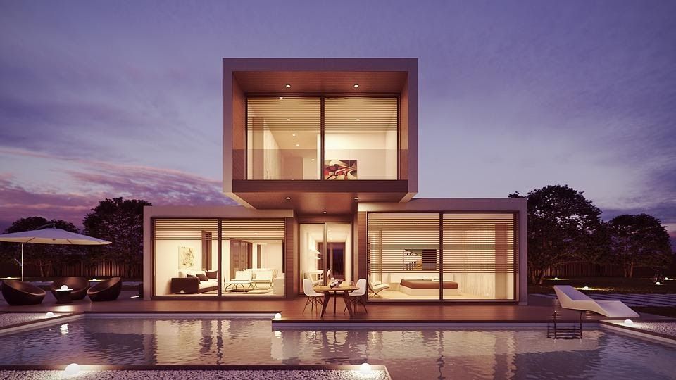
Interestingly, we have eased the stress for you by carefully identifying the 15 best architecture portfolio websites to consider for inspiration and design ideas for your web. These websites were selected based on their visual design and overall user experience. Let’s get straight into it!
15 Best Architecture Website Portfolios for Inspiration
1. L’ Atelier
The first on our list of the best architecture portfolio websites for inspiration is the L’Atelier website. L’Atelier is a full-screen website featuring brilliant on-scroll animation effects and amusing transitions that engages visitors in the best way possible.
Most importantly, this website perfectly blends whitespace and media content. The website is also very easy to navigate.
If you want to replicate the full-screen designs and brilliant transition effects on your website, then the FullPaje.js one page snap component is all you need. FullPage.js can also be used with Elementor, Divi, and Guttenberg editors for WordPress.
2. Archi-Graphi
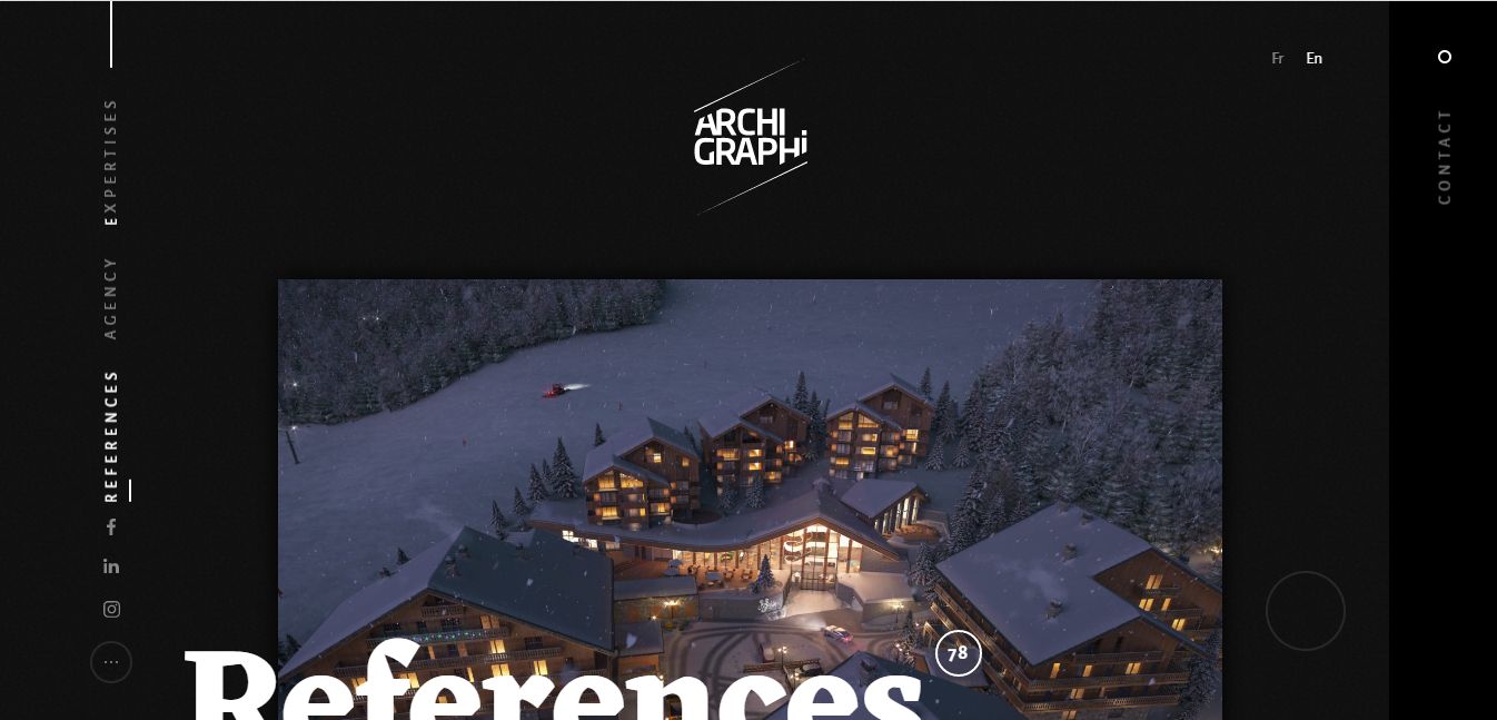
Archi-Graphi architecture portfolio website features brilliant scrolling animation effects plus high-quality images.
With a monochromatic background, this website portrays a minimal yet sophisticated and visually appealing layout and design, catering to the dramatic and high-contrast feeling it registers in the mind of visitors and users.
3. Jacek Slotala – Arquitect Portfolio
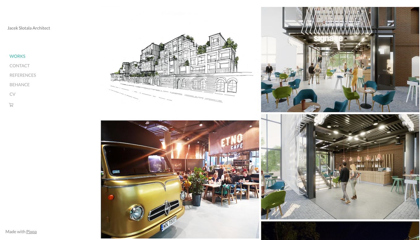
Jacek Slotala Architect is an architecture and design firm based in Poland. The website presents its work on a 2-column grid layout – placing the focus on the works on display.
The side-navigation layout also makes other pages easily accessible to the viewers by putting them within their reach.
The centered primary CTA on the sticky navigation bar makes it easy to identify – no matter where a user is on the page.
4. SOM
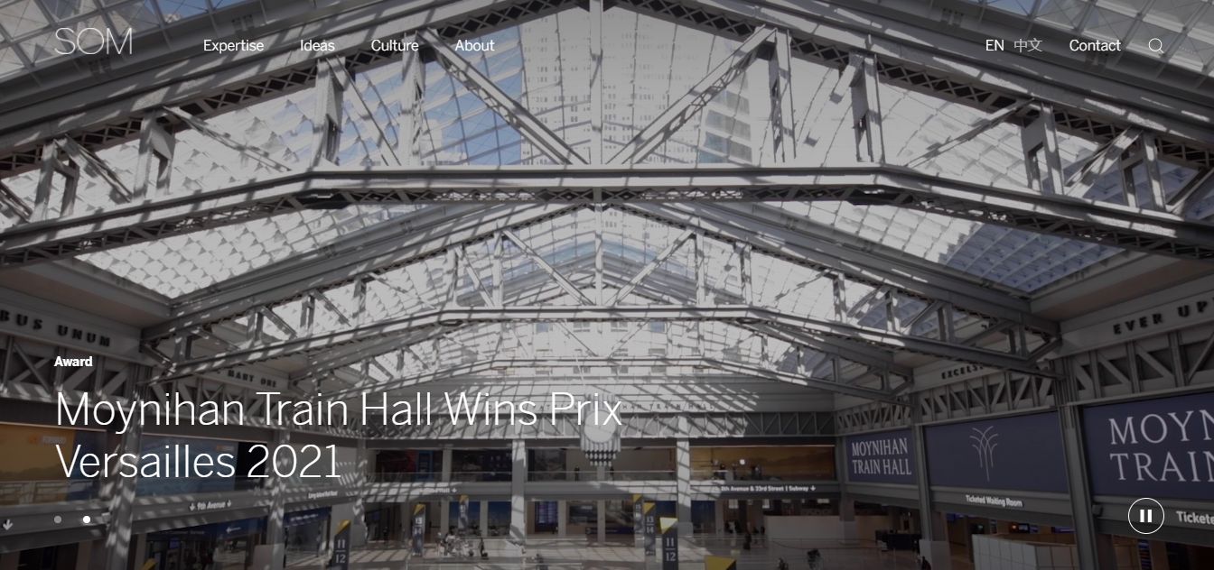
SOM website is ideal for architecture firms looking to showcase their experience as quickly as possible on their website. Featuring a simple grid layout and smaller thumbnail images, you can let your visitors and users immediately know the projects you have completed in the past.
The interactive hero video at the top of the website, solid black background, and bold typography are “just enough” to keep users glued to this architecture website portfolio.
The background video is one of the strengths of this website. Take advantage of this feature by learning how to create a background video just with CSS.
5. Sergey Makhno Architects
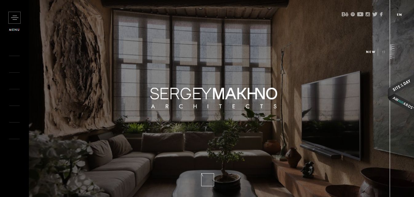
This architecture website portfolio proves that minimalism, sometimes, can be synonymous with brilliance.
Sergey Makhno features a hamburger menu, eye-catching images, sound effects, and smooth on-scroll animations capable of initiating interaction, keeping your visitors engaged, and, most importantly, ensuring a top-notch user experience.
Related article: Best architecture software for Mac
6. Quintessentially Estates
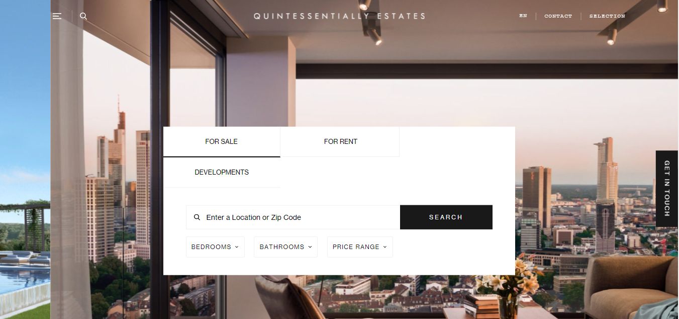
Quintessentially Estates is a sleek and clean architecture portfolio website featuring a minimalist header and contact button which hides other menus.
This design allows your visitor to focus on the main content on the website. The homepage also includes on-scroll animation effects, hero sliders, and a brilliant blend of solid colors that encourages users to scroll to the end of the site.
7. Foster+Partners
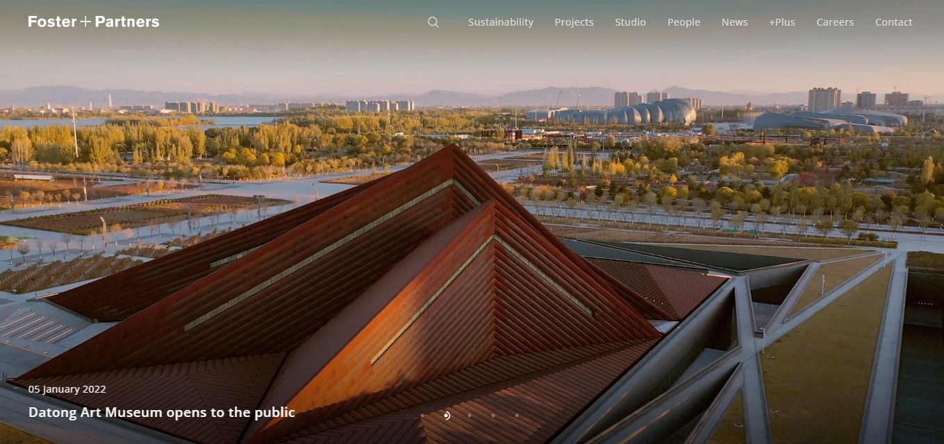
This architecture website portfolio prioritizes user-friendliness. Using photos as the core of the web design, this website features easy navigation and zero clustered layouts.
It also includes a well-integrated menu that doesn’t distort the website’s overall design. The Fosters+Partners architecture portfolio website is ideal for use as a portfolio website for architects
8. Effekt
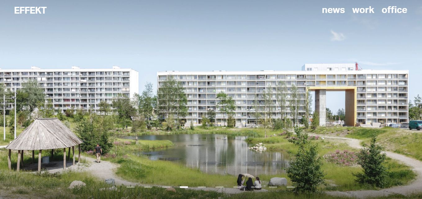
Effekt is well-structured, easy to navigate, simple, and clean. The homepage only includes three menu groups – work, office, and news – that draw visitors into the depth of the website.
This architecture portfolio website’s homepage also includes top-quality photos of their past projects, letting their prospects know what to expect from their firm immediately after they land on the website. Effekt is ideal for architecture firms looking to share multiple project samples without boring their visitors.
9. Olson Kundig

Olson is a modern and sleekly designed website with a blend of natural landscapes. This website’s design features full-width images and subtle animations.
The menu included at the top right corner of the website also contributes to its characterized ease of navigation, encouraging visitors to delve even deeper into their site.
With brilliant use of parallax effect, each slide effortlessly transitions into one another as you progress further down the page, creating an amusing and engaging effect on users.
Do you find the parallax scrolling effect fascinating and would want to include it in your website design? Check out this article to learn how to create a parallax effect using CSS only.
10. Largo Studio

Largo studio’s design is ideal for architecture firms looking to demonstrate their past projects responsibly and aesthetically, too. The homepage features exciting on-scroll animation effects, seamless transitions, and geometric graphics.
Largo shows that professionalism doesn’t mean monotony. Despite being a seemingly formal design, the website also portrays brilliance, creativity, and human interaction.
11. Nick Leith Smith
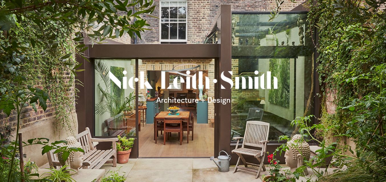
Nick is another perfect example of an architect’s or architecture firm’s portfolio website. Apart from easy navigation, another exciting feature of this website is the subtle yet addictive transition as you go down the page.
The use of high-quality images on the landing page also makes this site visually attractive and very engaging. It is an ideal way to showcase your past projects.
12. Shepley Bulfinch
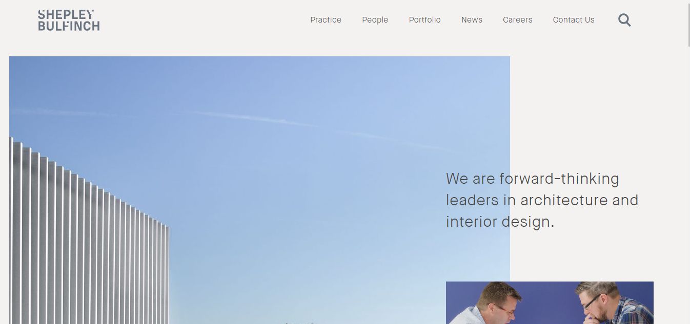
This website uses parallax scrolling effects and mixed media. Navigation is also easy; the relatively simple website layout helps eliminate distraction, ensuring visitors find what they seek quickly.
Related article: Best Interior Design Websites For Inspiration
Shepley Bulfinch features an exciting blend of video and photo content, making it interesting and interactive, improving the overall user experience
13. BIG
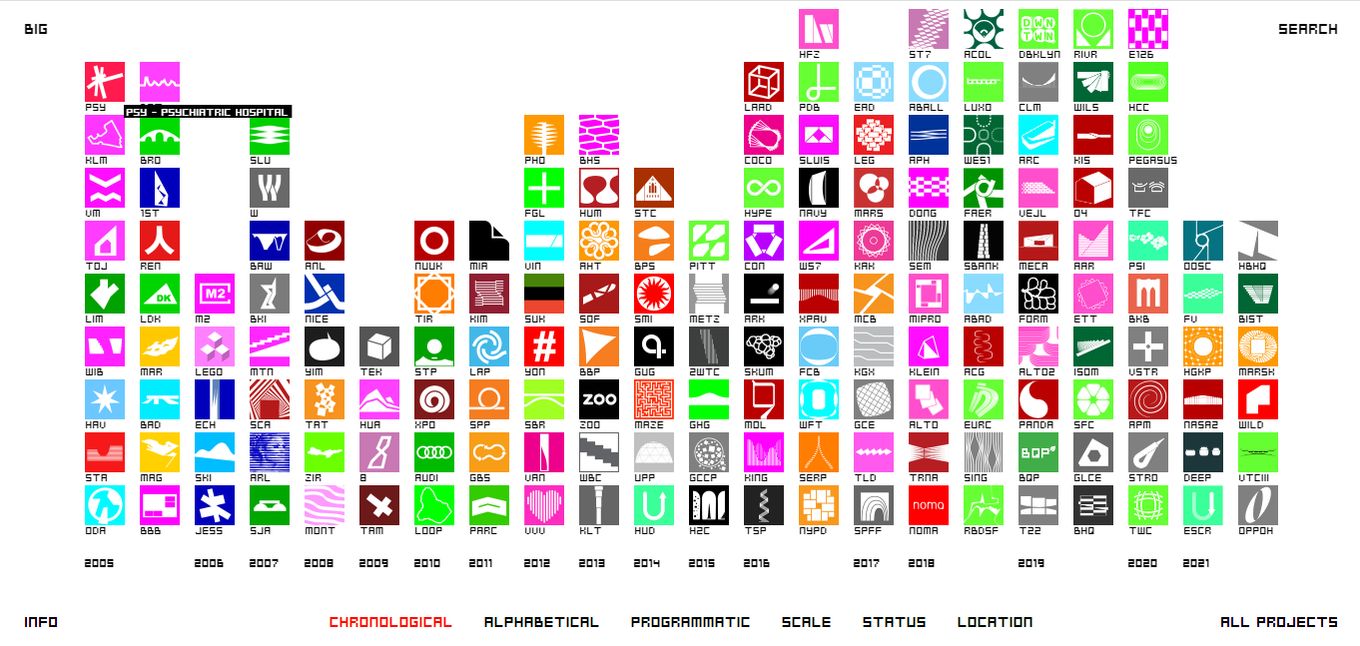
BIG is a hundred percent based on creativity. While this website may appear excessively experimental, noteworthily, it’s a way to explore the creative aspect of the web. BIG features an abstract layout, creating an interactive and amusing outline to showcase your project portfolio.
14. Kilograph

Kilograph architecture website portfolio uses eye-catching and interactive full-width hero videos to ensure visitors don’t leave the website immediately.
The website also features clean typography, layout, and gifs, contributing to its visual appeal. The subtle yet engaging animations used also help improve the website’s overall user experience.
15. Snohetta
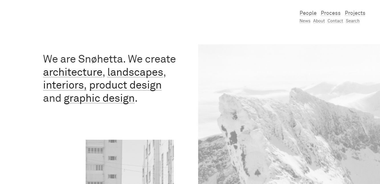
Snohetta features a serene and elegant design with a brilliant blend of multiple shades of white. With a feed-style homepage, this architecture portfolio website effortlessly immerses its visitors in their previous projects without risking monotony.
Snohetta also has an efficient layout and easy navigation that naturally guides users to all areas of the website. The gorgeous typography included in its design is also worthy of mention.
16. MAFCOHouse
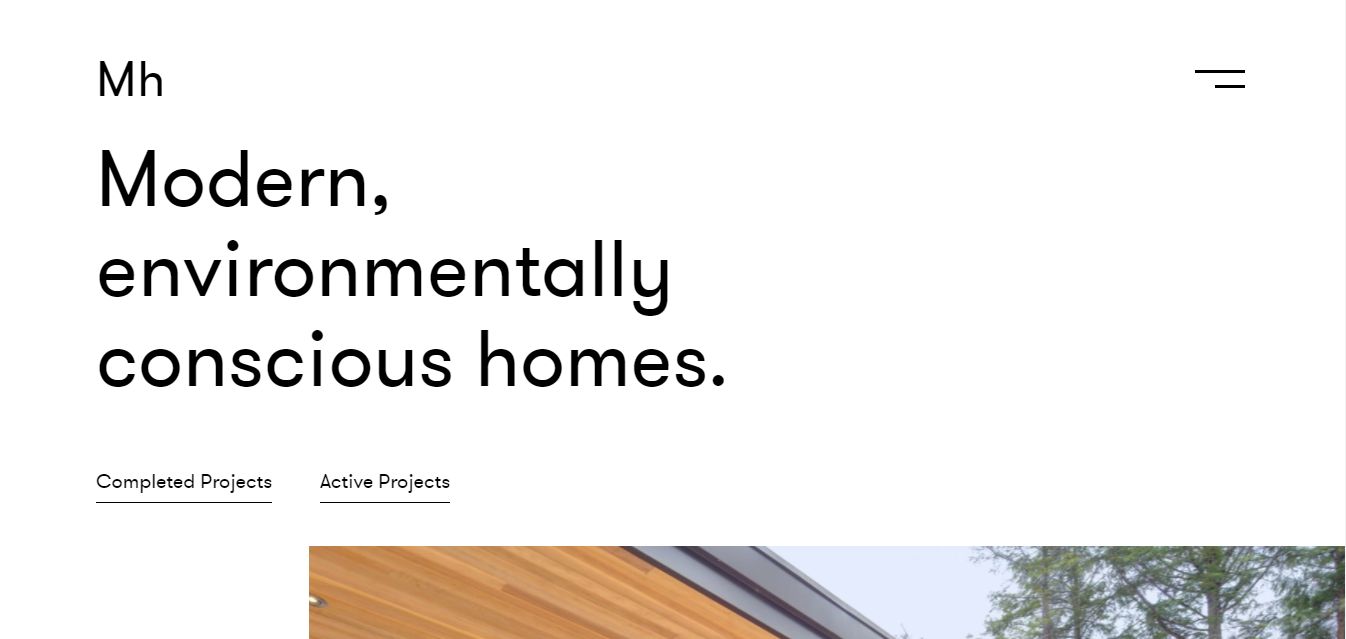
MAFCOHouse’s website creates an environmentally-conscious feeling in the mind of its users. It features a simple design with bright top-quality images.
It is also easy to navigate, seamlessly blends whitespace with text and media content, and focuses on connecting its visitors with nature. The bold typography employed also makes the website engaging and interactive.
Conclusion
You must have noticed that most of the best architecture websites outlined in this article have a clean design, include a social proof, a layout that clearly shows their past projects, and is very easy to navigate. These properties are the major factors that will differentiate your architecture portfolio website from the rest.
So, there you have it: the 15 best architecture portfolio websites to draw inspiration for your next architecture website project! Nonetheless, should you have further questions? Do not hesitate to ask via the comment section below.
![21+ Best Artist Portfolio Examples [Get Inspired!] artist portfolio websites share](https://alvarotrigo.com/blog/wp-content/uploads/2023/08/artist-portfolio-websites-share-300x150.png)
![9 Stunning Website Layouts [Examples For Inspiration] website layouts share](https://alvarotrigo.com/blog/wp-content/uploads/2023/08/website-layouts-share-300x150.png)
![10 Best Medical Website Design [Examples] medical website design share](https://alvarotrigo.com/blog/wp-content/uploads/2023/08/medical-website-design-share-300x150.png)
![20 Amazing Photography Portfolio Examples [2024] photography website examples share](https://alvarotrigo.com/blog/wp-content/uploads/2023/08/photography-website-examples-share-300x150.png)
![Top 10 Aesthetic Websites [Inspiration for 2024] aesthetic websites share](https://alvarotrigo.com/blog/wp-content/uploads/2023/08/aesthetic-websites-share-300x150.png)
![15 Best Restaurant Websites [Examples for Inspiration] best restaurant websites share](https://alvarotrigo.com/blog/wp-content/uploads/2023/08/best-restaurant-websites-share-300x150.png)