I’ve written about carousel web design before and there are many different types, from news sliders and eCommerce sliders – but do they all follow best practices?
That is something that this article will answer for you. In this post, the goal is to go through some web carousel examples and understand what makes a good carousel UI and which design works well.
There is no doubt about it that carousel webs are extremely popular among the web developer community. They are just such an easy way to show a great deal of information or content in a single area. And it is not difficult to create a carousel with pure CSS.
Practically every modern browser supports them but… are they worth your time? What are the benefits and do they work for every type of audience?
Let’s jump in and find out.

What is a Carousel UI?
A carousel UI (Carousel User Interface) is a website element that displays the information in a set of elements that we can slide, fade or somehow move into view. It can be a slideshow of images, texts, videos, or a combination of all of them.
For example, you may have a product landing website that sells clothes and have a product carousel that slides between each set of clothes, sometimes a limited number like 5 or sometimes infinite.
Take the example below. This is distinctively a carousel slider and it shows how it doesn’t just have to be images: each item is an HTML card built up of many components.
We can see the bullets which act as an indication of how many items are in the carousel and the left and right arrows indicate we can switch between more.
Related article: What is a Slider?
Above is a classic example, but carousel sliders can come in all shapes and sizes. Now that we know what they are, we should understand what makes a good carousel website design.
Are carousels good for UX?
Carousels are generally a good practice from the UX (user experience) point of view as long as you use them in the right places, for the right purpose, and in the right way.
It’s widely known that carousels are not a good practice to convert users as visitors are likely to skip parts of the carousel.
However, this won’t apply to all kinds of carousels and we won’t necessarily be showing vital information in secondary slides.
You’ll be able to find carousels on the biggest websites out there. From Youtube to Netflix, Amazon, Apple, Dreamworks… Carousels are a UI element that is here to stay and that will still be widely used because they serve a great purpose when used correctly.
Carousel UI Best Practises
After seeing some real-world carousel web design examples, you should be able to understand what I have been talking about with good design: carousels must be used carefully and present easy navigation.
Here are some vital key points and guidelines when considering implementing a carousel yourself on your website.
-
Only include at least 3-4 minimal and don’t go over 10 slides. People often as “How many items should be in a carousel?” Having too few will seem pointless and will probably be better to choose one slide and use it without a web carousel. Too many slides will also be pointless because the user probably won’t view that many, they like to scroll usually.
-
Use High-Resolution images, graphics, and videos. Most of the time web carousels are used in large sections like in landing pages at the top where your hero section will be. The poor resolution won’t make your design look good and will be off-putting to visitors, you want to look professional.
-
Try to include useful CTA (Call To Action) buttons over the top of each slide in the carousel UI. While it is good to show off an image, if the user likes what they see, guide them to another page to increase traffic.
-
Always indicate how many slides there are. If you do not, a user may feel lost and bored because they don’t know, let them feel in control of the website. Either use numbers or navigation dots. We have explained here how to create a sidebar bullet navigation.
-
Always stick to navigation that just works. By that I mean just your left and right arrows and don’t bother to try and do something fancy. It feels natural to see arrows and they are easy to understand.
-
Offer a pause button so that the user can view the content in their own time. If you have lots of slides and want to use auto-play, make sure it doesn’t play too fast, this may become annoying to the user. Let them feel in control.
-
Make sure the sound is always muted and offer a button to unmute: no one likes auto-playing music on a website, a user will click away.
-
Probably best to only have a maximum of 2 carousels per page. Usually, a carousel UI works best as the main event, like at the top or in the main section. Any more than 2 on a single page is just going to be a chore for users to click through, only use web carousels for engagement.
Carousel UI Examples
Now that we have learned more about what features make a carousel web design great and why they matter, I want to show you some examples of real working carousel UI sliders.
1. Dreamworks – Full-screen Carousel
Dreamworks uses a great carousel on their landing page to advertise its movie. The whole page behaves like a full screen carousel that snaps to the next/previous section. This way, it creates a unique user experience that comes with lots of benefits from the marketing point of view.
Images snap perfectly into view and the user ends up having a great immersive experience.
If you want to replicate this effect, you can use this fullscreen website component. fullPage.js includes multiple transition effects and it can be used with WordPress for both Elementor, Divi andGuttenberg builders.
2. SquareSpace
Squarespace is a website known for its web-building service. Their homepage obviously needs to be minimal and impressive. And yes, they are also using a carousel.
Their carousel shows a clear navigation system using the slide numbers and simple arrows to guide us. The whole carousel just uses a simple sliding animation which is subtle and performs well.
When you get to the end, the web carousel repeats itself from the start, so the user can begin the carousel again. They are not forced to rapidly click to get back to the start, great for useability. Quite interesting Carousel UI, isn’t it?
3. Netflix Carousel UI
Netflix makes use of multiple horizontal carousels to provide us with a fast way to slide through movies within different categories.
It’s a great example of how the use of a carousel UI can provide a better way to navigate the content of a website. We save space and we still provide visitors with a great user experience by allowing them to access more information on the same page if they wish.
4. Dreamworks – Website Carousel UI
Another great example of how a website carousel design effectively showcases lots of content in one area. This one uses a fullscreen layout but only in the horizontal view and does not use the vertical space at all.
Each slide uses the entire screen and impressive images to engage users. The navigation is fantastic: just simple buttons that are included in the design very well.
We have the dots at the bottom center to indicate where we are and one page even has a subpage indicated by the line between the dots.
The transition between slides uses a fancy circular zoom animation, it works well and is smooth, with no lag or bad performance. This fancy transition encourages the user to click to view another page/slide.
5. Amazon – Carousel UI
Like Netflix, Amazon also makes use of multiple horizontal carousels in their main website as well as in other sub-pages.
When people ask: “Are carousels good UX?”. The answer can only be YES. There are great uses for carousels and the biggest websites in the world make use of them in just the right way.
6. Usain Bolt
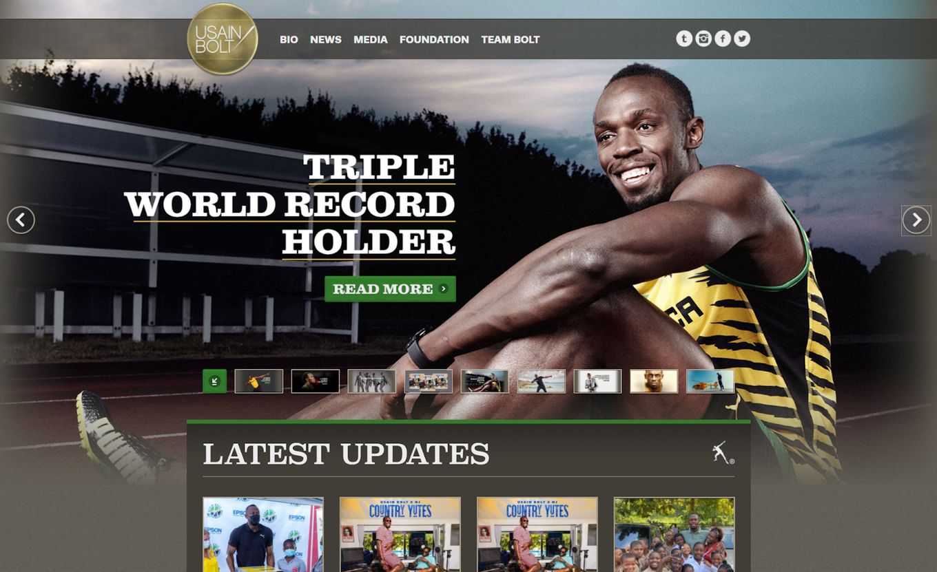
Here we have a more traditional carousel UI example. Straight away, considering what we discussed earlier, we know we have a web carousel: it is clear by the left and right arrows which are easy to see.
The carousel is on auto-play and it uses a fair time-out of around 8-10 seconds, so images are not changing too much and feel balanced. We also still have control over the change by using the navigation.
Another great feature we have is that, instead of indication dots, we have a thumbnail indicator below the carousel that we can also click on for navigation.
Final Thoughts
So, we’ve been through what defines a web carousel, we have learned what makes a good carousel UI great and we have seen some real-world examples.
After seeing the examples, this should get you in the right frame of mind if you are thinking of using a carousel, follow the guidelines I have set out and you should be absolutely fine.
Carousels are amazing at displaying content while maximizing the space on the screen, they help engage the user and bring interactivity to your website. Just be careful and don’t overuse them. While most audiences will not mind a carousel, you’ll need to consider the features required for each audience and keep the carousel UI useful and not annoying.


