In this article, we will explore the wonderful abilities of a website news slider. We will understand what makes them useful, where to use them and why they can be great for a news website or online magazine company.
Online media publishers are always looking for new and fancy ways to display their content. A news slider works wonders and lets a company maximise the space on the website, especially when you want to display lots of important breaking news in one area.
So let’s start with what a news slider is and move on to explore them in more detail and provide you with some amazing examples you can use.
What Is A News Slider?

A news slider is a type of carousel. They are designed to quickly showcase content, which could be images and text in a specific area on a webpage.
A news slider typically can be seen on news websites, media publishers’ blogs or portfolio websites. Most of the time these news sliders will have around 3-5 posts and they will auto-play between each one, creating a carousel effect. The user then clicks on each of them to be taken to a new page.
News sliders can be static (where the content is kept the same and may be updated manually) or a modern, fancy news slider can have content generated dynamically, keeping the content and website fresh and up-to-date.
Why You Should Use A News Slider
Now that we know what a news slider is and where we might find them, let’s go through why you might find them useful and what their benefits are.
- Maximize Viewport: One of their greatest benefits is the amount of space they take up on the viewport. They enable you to fit more information and content in one area, easier for viewing and interesting to look at.
- Dynamic Content: A news slider can be set up so that their content is rotated or updated every day, keeping the content fresh and up-to-date.
- Visually Appealing: A normal wall of text may overwhelm a lot of users and make your content hard to consume, but a news slider keeps users focused and engaged with the content.
- Call To Action: In a website where clicks are powerful, the news slider can help introduce a clear call to action (CTA) for the user, getting them to click an article or do something on your website.
What Makes Good A News Slider
We now know what a news slider is, we have gone through the benefits but… what about how a good news slider looks? There are many examples or designs to choose from but which are the best? That is why we will now go through what you should consider when looking for a great news slider.
- SEO Optimised: With any decent news slider you’ll want it to be SEO friendly. Otherwise, how will a search engine like Google be able to navigate your content? SEO friendly means the external and internal links should be HTML
<a>tags and be easy and simple. No fancy JavaScript clicks, otherwise a search engine will find it difficult to index your content. - Different Content Types: A news slider can be used for different things: maybe you have a blog, media website or photography portfolio. A good slider will allow you to use different templates or easily edit the template.
- Dynamic Content: While not required to make a good slider, it can be useful that the slider supports dynamic updates, but manually updating may suit most people. It just depends on your use case and how frequently your information changes.
- Mobile-Friendly: If a new slider looks great on a desktop, you’ll want it to also look good on mobile devices. So make sure it is responsive or that it is easy to edit the CSS to make it responsive yourself.
- Customisable: Not required but a decent news slider will be easy to change and adapt to your use case.
10 Amazing and Inspiration News Slider Examples
Hopefully, by now, you understand more about news sliders and what makes them great. News sliders can be a useful way to introduce content on your webpage and keep users engaged, so let’s take a look through some great examples.
1. fullPage.js Slider
If you are looking to really create a unique experience and want to take advantage of the whole screen space, fullPage.js is your go-to choice for such a design.
You can create full-screen scrollable web pages which can act as a news slider or portfolio website, allowing you to show off large high-resolution images and can easily add some text above, creating a very immersive viewing experience.
It is available for Elementor and Gutenberg. There is also a ready-to-use WordPress theme.
2. Jssor Slider

A great example of a sales image slider with smooth animations. It can be used as a hero slider section on a website. Clear slider with dots to indicate how many there are.
This one is very customisable and fully responsive. You can copy this style by creating a JavaScript Image slider and maybe adding some CSS animations too.
3. Slippry Slider
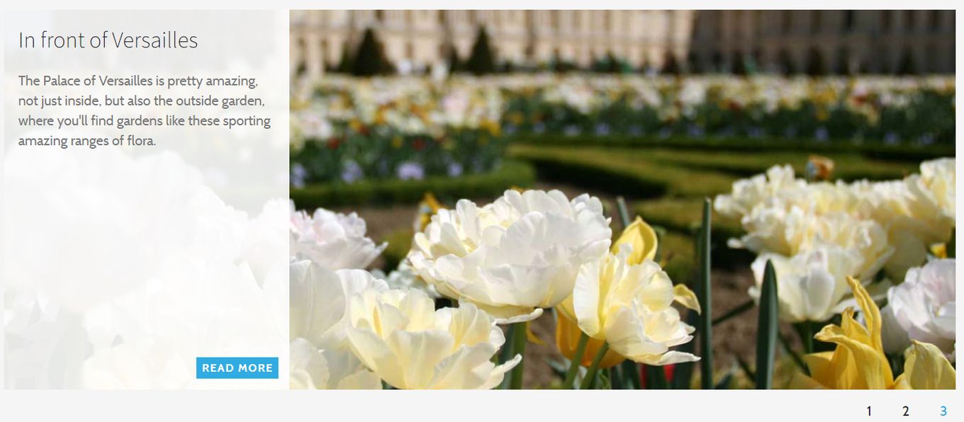
A news slider with a left side area for a title and some text. An image helps engage the user but text can be used to confirm what they want and the “Read More” acts as a nice CTA (Call To Action) button. We recommend that if you choose this style, you add CSS hover effects to the buttons to make your news slider a bit fancier.
4. 3D Text And Image Slider

This one only uses CSS to pull off a 3D-based carousel news slider. It looks cool, it is very easy to set up and it does not require any major dependencies. Each post has space for text and an image, allowing you to place your “Read More” link.
5. WOW Slider
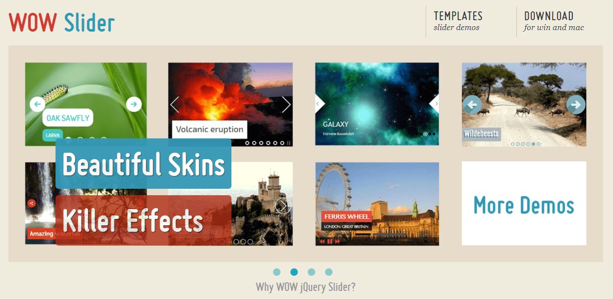
Another great multi-purpose news/post slider with lots of customisation and options. It has a lot of different 3D effects that are smooth and easy to watch. Very compatible and responsive. Works with touch screen devices and can work both with jQuery or as a CSS-only widget.
6. Owl Carousel Slider
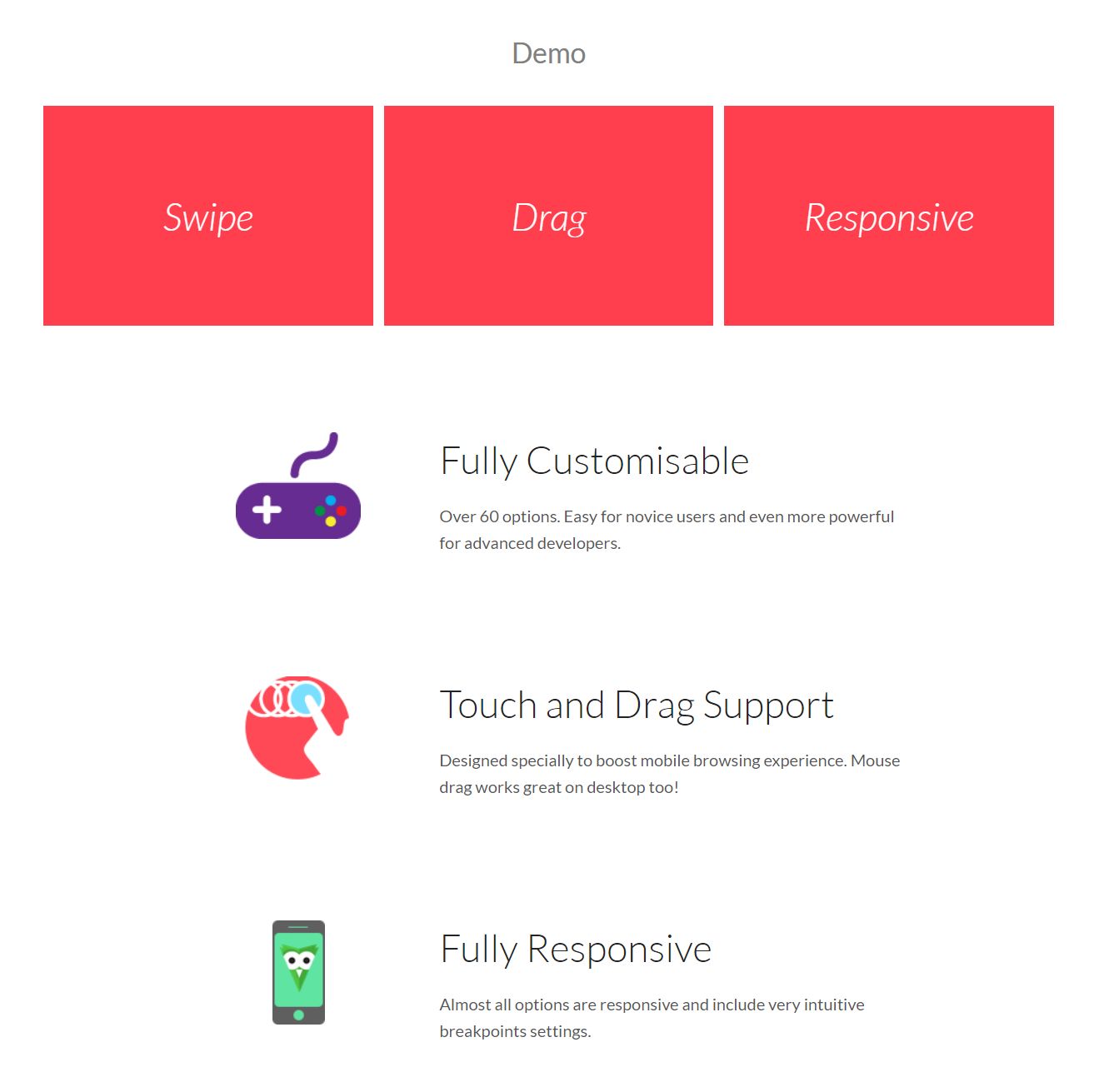
A jQuery based carousel library that has many options and is easy to set up. It has different templates to choose from and allows you to edit the style yourself so you can adapt it to your branding and content.
7. CSS Slider Project

A full featured CSS based carousel slider project that you can use and adapt to your liking. No jQuery and no JavaScript, so no need to worry about that. Pure HTML and CSS powering this one. It has many effects like fade, zoom and slide to choose from and works on many devices.
8. CSS Accordion Slider
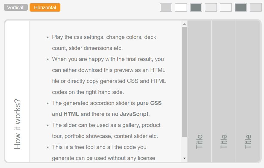
If you are looking for a full-blown generator and less coding, this one’s for you. The whole site allows you to set up your slider and then copy and paste the code into your website. A bit different from the others, but you can choose vertical or horizontal layouts. Each section can have its own title and then the content shows when clicked and slides into view.
If you are interested in CSS accordions check out our these examples with pure CSS accordions.
9. Essential Post Carousel Slider
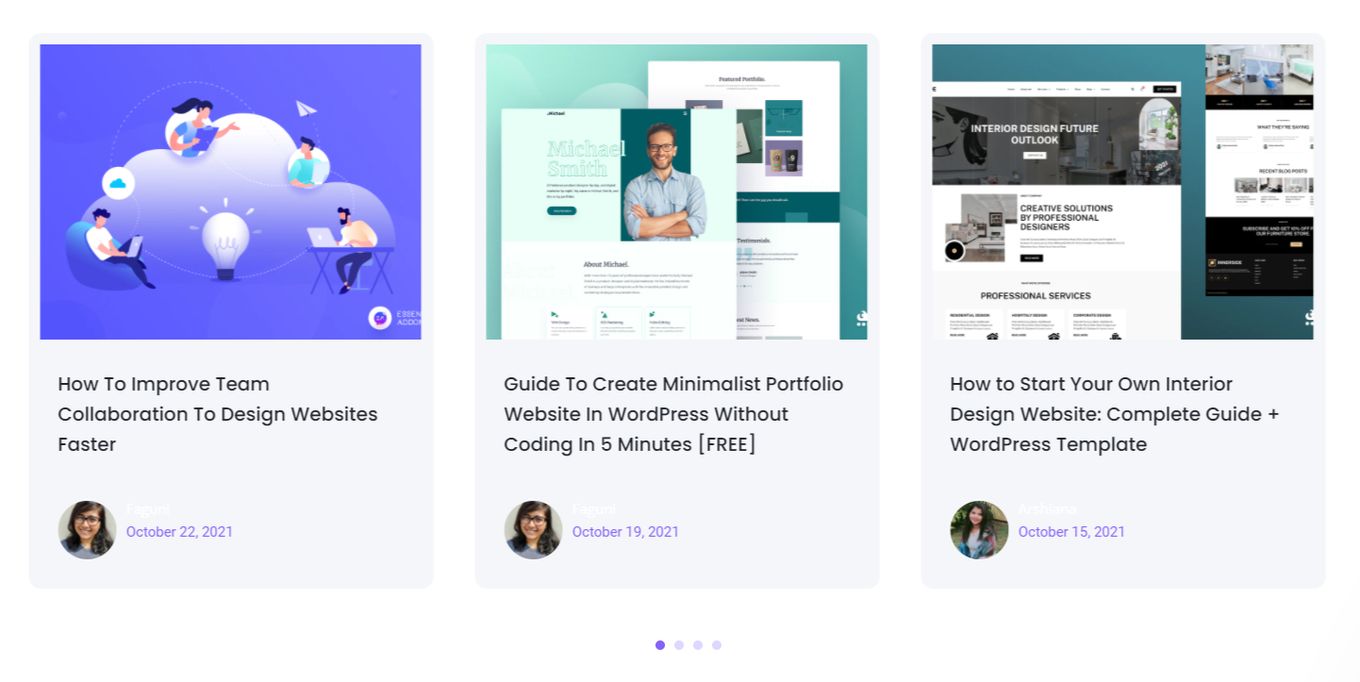
A project which focuses on ease of use and is compatible with WordPress and Elementor. EA Post Carousel has many features and is easy to work with, you can change the layout, transition effects, post styles and set hover events. It is very feature rich and a great match for WordPress developers.
10. Elegant Themes Slider
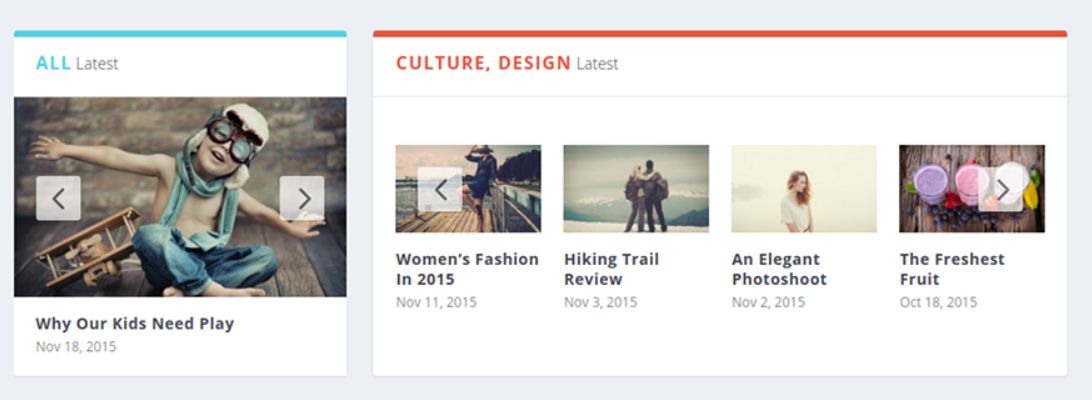
Good for different website layouts and has lots of features. It works great with different sized images and text content. You can set things such as post limit, autoplay and heading style.
Final Words
Hopefully we have provided you with some great news slider examples and that you understand more about news sliders and what makes them useful. We’ve learned about their benefits and the different types that you might come across. Each kind of slider has its place and purpose, make sure you utilise sliders correctly and use them to maximise the space on your website according to your website layout.
Related articles
More articles which you may find interesting.
![12 Amazing Slider Website Designs [Examples & When to use] slider website design examples share](https://alvarotrigo.com/blog/wp-content/uploads/2023/08/slider-website-design-examples-share-300x150.png)
![Carousel UI Website Design [Best Practices & Examples] carousel UI share](https://alvarotrigo.com/blog/wp-content/uploads/2023/08/carousel-UI-share-300x150.png)
![11 Must-Have Skills If You Want to Be a Web Developer [2024] web developer required skills share](https://alvarotrigo.com/blog/wp-content/uploads/2023/08/web-developer-required-skills-share-300x150.png)
![20 Cool HTML & CSS Tabs [Examples] html css tabs share](https://alvarotrigo.com/blog/wp-content/uploads/2023/08/html-css-tabs-share-300x150.png)
![15 Best Portfolio Website Builders in 2024 [Reviewed & Ranked] portfolio website builders share](https://alvarotrigo.com/blog/wp-content/uploads/2023/08/portfolio-website-builders-share-300x150.png)
![20 Beautiful Squarespace Website Examples 2024 [Get Inspired] squarespace website examples share](https://alvarotrigo.com/blog/wp-content/uploads/2023/08/squarespace-website-examples-share-300x150.png)