Sometimes, you may wonder how to make your website very interesting and engaging for visitors immediately they land on it. It’s simple! With a modern and brilliantly designed hero slider, you can be sure of having an amazing-looking website that will interest your visitors in the best possible ways, thereby reducing your website’s bounce rate.
With a little knowledge of JavaScript, you can easily create a JavaScript image slider. Make it full-screen and you’ll have a hero slider design.
But before creating your own hero slider, let’s understand what they are exactly and why you should use them on your website. Then we will show you the top 10 hero slider designs for inspiration. Without any further ado, let’s get into the details.
What Is A Hero Slider?
Hero sliders are large, featured sequences of images displayed prominently at the top of a webpage. They are typically used on homepages and landing pages.
A hero slider design is an extension of hero images: big images that typically come alive on the screen. When these kinds of images are displayed at the top of your website are also referred to as hero headers.
So a hero slider would be a composition of multiple hero images presented in sequence, using brilliant transitions, animations, and compelling captions.
Check out what is a slider? if you still need some more clarification on this.
Why Use Hero Sliders?
Hero sliders are handy because of the way they amuse, engage, and draw your visitors’ attention to navigate deeper into your website. A typical hero slider design includes the following:
- Clear navigation button.
- Compelling Call to Actions.
- Stunning and amusing photos.
- Brilliant transition effects, etc.
These features are majorly contributed to the performance of your website and help you reach your ultimate goal, whether engagement, downloads, sales, etc.
Generally, a hero slider is used to welcome visitors or users to your website. Therefore, you should consider telling a story with your sliders; let such visitors know your point of view. For example, when used on your online portfolio, you can tell the story using a testimonial slider or an HTML Timeline.
Below are a few hero slider design examples to help you build the perfect hero slider for your website!
Top 10 Hero Slider Designs
1. Dreamworks – How to Train your Dragon
Dreamworks uses a great product landing page to advertise its movie. The whole page behaves like a full screen slider that snaps to the next/previous section. This way, it creates a unique user experience that comes with lots of benefits from the marketing point of view.
Images snap perfectly into view and the user ends up having a great immersive experience. Ideal for storytelling, marketing pages, and websites with beautiful visuals.
If you want to replicate this effect, fullPage.js is all you need. It includes multiple transition effects and it can even be used with Elementor or Guttenberg editors for WordPress.
2. Mogu Mogu

This website features an amusing splash of fruit on their hero background images, with each slide having different themes according to the product variant being promoted. The brilliant use of overlay text and a blend of background colors made the hero slider design stand out to use. You can scroll through the sliders using the Mogu Mogu variants just below the hero image of each slide.
3. Xiaomi Website Slider
Unlike other traditional sliding carousels, Xiami uses a website slider that fades between slides. This creates a simple, fast, and less distracting slider that serves the same purpose.
If you are into full screen pages, you can get something similar by using fullPage.js together with the Fading Effect extension.
4. Lonely Planet

Lonely Planet is a simple, typical hero slider with compelling captions that would “force” visitors to browse the entire website: each slide transitions to the next one after a few seconds. It’s a fantastic way to increase conversion rate, turning your visitors into returning customers without much effort. It is ideal for travel website designs, event planning, etc.
5. Fluido

Fluido features a stylish user interface, thanks to its use of unique website layouts and modern, vibrant colors. CTAs are also strategically placed on each slider, as mentioned earlier, making your visitors know what you want them to do. Fludio offers vertical transitions.
6. Viva Hotel

Viva is a hotel website design where the text animation effects are employed to create an amusing impact on visitors, grabbing their attention and causing them to stay longer on your website. You can navigate each slider using the arrows placed on each side of the hero header.
7. Huxton

Although simple, Huxton features a fully functional hero slider design, designed particularly for online shopping. You can display product images on each slider with compelling CTAs to help your visitors visit the right section of your website to purchase. Perfect for product landing websites. Huxton hero slider design also includes two navigation arrows on both ends of the page for easy scrolling.
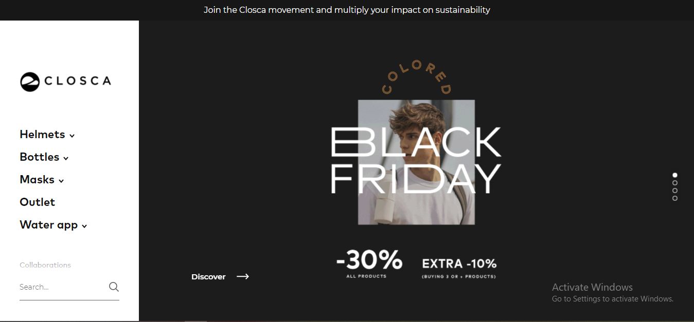
8. Closca

Closca features landscape transitioning. Each slider serves as a product carousel, including compelling overlay texts and CTAs to point your visitors in the direction you want them to go. Like Huxton, the hero slider design used in Closca is ideal for online shops, product pages, etc.
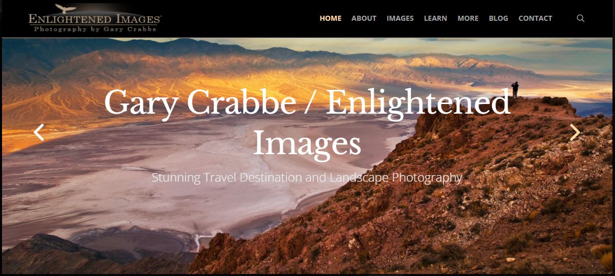
9. Enlightened Images

This website features a hero slider design with simple yet beautiful and stylish still background images. This design is fully customizable and responsive. However, this stunning layout doesn’t have a CTA section. It also features two arrows on each end of the page for easy navigation. The sliders also transition into each other automatically.
10. Unruly

Unruly features a “busy” hero slider, with multiple CTAs and overlay texts that describe the website’s offerings. It’s a brilliant way to let your visitors know what you do immediately when they land on your website. Unruly also includes automatic transitioning between the sliders, creating a somewhat amusing effect.
Ready to Create Your Own Hero Slider?
Hero sliders are one of the significant visually appealing trends in web development nowadays. If designed correctly, you can help your visitors and users quickly familiarize themselves with your offerings and take desired actions.
Of course, an awesome hero slider requires an excellent design. Thanks to solutions like the FullPage.js JavaScript component you can create brilliant hero sliders with little or zero effort, using features such as animations, mouse-wheel scrolling, landscape, and vertical transitions, etc.
We hope this guide has helped you find the right inspiration to design your hero sliders, too. Do not hesitate to share any comments, questions, or thoughts via the comment section below.
![10+ Amazing Flat Design Websites [for Inspiration] flat design website share](https://alvarotrigo.com/blog/wp-content/uploads/2023/08/flat-design-website-share-300x150.png)
![15 Portfolio Websites For Graphic Designers [Build Yours Now] websites graphic design portfolios share](https://alvarotrigo.com/blog/wp-content/uploads/2023/08/websites-graphic-design-portfolios-share-300x150.png)
![12 Amazing Slider Website Designs [Examples & When to use] slider website design examples share](https://alvarotrigo.com/blog/wp-content/uploads/2023/08/slider-website-design-examples-share-300x150.png)
![9+ Best Contact Pages To Get Inspired [+ 15 Free Contact Forms] contact page examples share](https://alvarotrigo.com/blog/wp-content/uploads/2023/08/contact-page-examples-share-300x150.png)

![15 Best Portfolio Website Builders in 2024 [Reviewed & Ranked] portfolio website builders share](https://alvarotrigo.com/blog/wp-content/uploads/2023/08/portfolio-website-builders-share-300x150.png)